The Actual Net Return
A Rigorous Analysis of What the Market Really Delivers After Volatility, Activity, Fees, and Taxes — and What to Do About It
A Whitepaper for Anyone Building Wealth Today or Approaching Retirement
Accumulation series · The Actual Net Return · the Whitepaper — the complete reference layer, one of four.
About This Analysis
I am a Retirement Income Specialist, and my practice spans the full financial lifecycle — wealth building during the accumulation years, and the design and implementation of coordinated retirement income strategies in the distribution phase. I have been in this role for nearly twenty years. I currently serve more than 500 clients across the full age and financial spectrum, in every state in the country.
The analysis here draws on one hundred years of historical S&P 500 return data (1926–2025), peer-reviewed academic research in the retirement income field, and my own experience designing both the market-based and the insurance-based components of comprehensive retirement plans. The mathematical methodology — including the calculation of volatility drag, the modeling of fee compounding, the application of realistic tax treatment, the rolling-window historical framework, and the gross-up calculations for apples-to-apples instrument comparisons — is documented in the Methodology section at the end of this paper so that any conclusion drawn can be independently verified by the reader.
My standpoint is that of an integrator: I evaluate market-based and insurance-based instruments on identical analytical terms. The conclusions here point to a combined architecture of market-based growth assets, contractually guaranteed instruments, and non-correlated capital reserves — not because any one of them is superior to the others, but because each addresses risks the others cannot. When I recommend specific products and carriers in a client engagement, I select them from a broad range of carrier appointments, to match the right structure and the right company to that client’s situation.
Who This Analysis Is For
The framework presented in this paper is relevant for any adult who has begun building income and can establish a consistent savings habit. There is no specific age band that defines the right audience.
For younger readers — anyone in their late teens, twenties, or thirties who is old enough to be classified as an adult and able to save consistently — the coordinated framework is especially powerful because of the time value of money. Time is the most powerful single variable in any compound-growth calculation. The same framework applied at age 25 produces meaningfully larger outcomes from the same monthly contributions than the age-42 case study used in Section 10. Beginning the analysis early means the volatility buffer can be built up over decades rather than years, the Lost Opportunity Cost of delaying is meaningful, and contractual guarantees compound on contractual guarantees for decades before the distribution phase ever begins.
For older readers — including readers in their late 50s and 60s who may believe they are “too old” for properly structured whole life insurance to make sense — the analysis still applies, and Section 13.6 provides a specific scenario directly relevant to this question. The Premium Offset Program illustration in that section shows what happens when a properly structured policy is funded for only 7 years instead of the 25-year baseline used in Section 10.4. The same structural advantages — tax-free income, non-correlated buffer capital, contractual guarantees — emerge with a substantially shorter funding window. Combined with the IRS Modified Endowment Contract (MEC) corridor dynamic, in which the required death benefit per premium dollar decreases at older ages to preserve tax-free distribution treatment, the conventional “too old for whole life” objection is weaker than it appears. Even with only 5 to 10 years of accumulation remaining before retirement, properly structured whole life still does what no market asset can — and arguably matters more as a volatility buffer at exactly the point when sequence-of-returns risk in retirement becomes the dominant concern.
The right question, at any age, is not “how old am I?” It is “what does my complete plan currently include, and what is missing?” The analysis below applies to that question regardless of the reader’s current age, time horizon, or stage of accumulation.
This whitepaper is produced for educational and planning purposes. It presents an analytical framework rather than a sales pitch for any single product. Where specific policy illustrations are referenced, they are used to demonstrate analytical methodology and to ground abstract concepts in concrete numbers — and the specific products and carriers most appropriate for any given client are matters to be determined in a one-on-one professional engagement, based on that client’s individual situation, health profile, time horizon, and existing balance sheet.
Executive Summary
The retirement income planning field has long been divided into two camps. One camp builds plans primarily around market-based investments, trusting that long-term equity returns will support retirement income with adequate margin for risk. The other camp builds plans primarily around insurance-based contractual guarantees, trusting that risk-pooled income streams provide more reliable outcomes than market exposure. Each camp tends to view the other with skepticism, and most client-facing financial planning conversations reflect one orientation or the other.
This whitepaper takes a different position. The most defensible retirement income architecture does not require choosing between these two approaches — it requires combining them. Market-based investing solves problems that insurance cannot solve. Insurance-based instruments solve problems that markets cannot solve. A complete retirement income plan integrates the two, and the integration produces outcomes that neither approach can produce on its own.
The financial services industry has built much of its client communication architecture around a single number: the average gross annual return of the S&P 500, typically cited as 10 to 12 percent over the long run. This number is historically accurate. It is also, when used as a planning assumption without adjustment, one of the most misleading figures in personal finance — and the gap between what it implies and what investors actually receive is large enough to materially affect retirement outcomes.
This whitepaper documents — rigorously, mathematically, and using one hundred years of actual market data — the gap between what the market produces on paper and what an investor actually nets after four unavoidable forces, collectively the Four Forces of Return Compression: volatility drag, activity drag, tax drag, and fee drag.
The findings are substantial. Across all seventy-six rolling 25-year periods of S&P 500 history from 1926 through 2025 — each run individually through the same cash-flow engine — the Actual Net IRR to an investor who captures the index’s own return (carrying only volatility, tax, and a 1% fee) has ranged from approximately 5.5% to 11.3% across the central 80 percent of historical outcomes (10th through 90th percentile, excluding statistical outliers at both extremes), with a median of approximately 7.9%. But most investors do not capture the index’s return, and not through any lack of discipline. Two separately measured effects stand in the way. The larger is manager underperformance: the actively managed funds that hold most retirement money trail the index they are measured against — roughly nine in ten do over twenty-year horizons, per SPIVA — before the investor makes a single decision. The smaller is the behavior gap: the ordinary human timing of when money goes in and comes out, which Morningstar’s Mind the Gap puts at roughly 1.2% a year, and which recent peer-reviewed work contests. Together they are Activity Drag — the cost of a dollar being actively managed and humanly handled rather than left to track the index. This analysis applies 1.5% per year, resting on the structural leg alone: conservative against a record in which nine of ten active funds trail their benchmark, before the behavior gap is counted. Even at that figure, the entire distribution shifts down again: a central range of roughly 4.0% to 9.8%, with the median Actual Net IRR falling to 6.4% (and the worst individual window, detailed in Section 7, netting as little as 1.46%).
The compression this represents comes down to two numbers a reader can subtract. Across the seventy-six rolling 25-year windows, the median Average Gross — the market’s own advertised arithmetic average — was 11.8%; the median Actual Net Return, after all four forces have taken their turn (volatility, activity, tax, and a 1% fee), was 6.4%. An 11.8% average became a 6.4% reality: a shortfall of roughly 5.4 percentage points for the typical window. And it was never a fluke of one bad stretch — in every one of the seventy-six rolling 25-year windows without exception, the four forces opened a gap between what the market advertised and what the investor realized, never narrower than 4.7 percentage points and, in the frothiest windows, as wide as 7.0.
On a $100,000 account held for 25 years, that gap is the distance between $1,625,718 and $472,014 — the ending the median advertised average (11.8%) projects, against the median Actual Net (6.4%) the record actually delivered. It is not a rounding error. It is the retirement.
This paper covers the accumulation phase in full. The companion analysis — covering the distribution phase and sequence of returns risk — documents why the problem compounds further, and why a properly structured volatility buffer strategy using non-correlated capital sources changes the long-term outcome materially.
The Wall Street Narrative and Its Mathematical Flaw
Two numbers, from the same market.
10.32% is what the S&P 500 averaged across the last twenty-five years — 2001 through 2025 — the quarter-century most of today’s savers have been investing through.
4.93% is what a real investor kept of it: on a $100,000 account, $332,750 after twenty-five years, once all four forces had taken their turn.
Both numbers are true, both come from the same twenty-five years, and every step between them is computed to the dollar in the sections ahead — reproducible on any calculator from the market’s own published returns. And lest 2001–2025 seem like an unlucky draw, it wasn’t the worst the record holds: across the market’s entire recorded century, 1926 through 2025, the average ran higher still, 12.11% a year — and the same four forces compressed every 25-year window that century contains. This paper is the anatomy of that distance, because the first number is what retirement plans are built on, and the second is what retirements are actually lived on.
1.1 The Assumption Underneath the Assumption
Before examining what the market returns, it is worth naming an assumption so common it is almost never said aloud: that a financial plan can be built on knowing, roughly, what is going to happen.
It cannot. A financial life is lived forward, through uncertainty, the entire way through — not only at retirement. No one is handed the sequence of returns, the timing of their own needs, the path of tax law, or the length of their life before living it. Every projection is a single guessed path drawn through a fog of possible ones, and the real future is almost never the path that was drawn. It is simply one of the futures that could have arrived — and it bends the moment a real life touches it.
This is not an argument against planning. It is an argument about what planning is for. If the future were a single knowable point, the task would be prediction: find the highest-returning path and ride it. But the future is not a point. It is a range — and it is a range in two directions at once, both of which the ordinary plan quietly treats as fixed.
The first is how much the money will earn. Consider how the reader already behaves, because the principle is one they have already accepted. No competent advisor puts a client entirely into the single highest-average investment available. Every prudent portfolio holds bonds — and bonds are not held because they out-earn stocks. They do not. They are held to narrow the range: to trade some of the average for a great deal more reliability about where any given year is likely to land. The width of that range has a name — statisticians call it standard deviation, the typical distance between the return you expected and the one you got — but the reader need not know the term to have already priced it into every allocation decision they have ever made. Accepting a lower average for a narrower range is the most ordinary act in investing. It is what the bonds are for. And it concedes the whole point: a resource that must be usable on an unpredictable schedule is not served by a good average — it is served by a good outcome in the particular year it is drawn upon. A magnificent long-run average can betray you completely in the one year you actually need the money.
The second is when the money will be needed — and this uncertainty is the one almost every plan ignores entirely. A projection built for a forty-two-year-old who intends to retire at sixty-seven quietly assumes something no life honors: that the money will sit untouched for exactly twenty-five years and be called upon only at the end. But a resource is rarely needed on schedule. A job ends at forty-nine; an opportunity appears at fifty-three; an illness, a parent, a child, a chance worth taking arrives in some year no projection marked. The plan that assumes twenty-five uninterrupted years is optimized for the one life in which nothing happens for twenty-five years — which is no one's life. So the uncertainty is genuinely twofold: not only how much a resource will earn, but when it will be called on. Neither is knowable, and a plan that assumes a fixed answer to either has replaced a range with a point.
So the real task is never to predict the future — not its returns and not its timing. It is to keep a family's resources useful across the whole range of futures that could arrive: available and productive whenever they are actually needed, wherever in the sequence that falls, with as little damage to the rest of the plan as possible when they are drawn upon. That is the objective this entire analysis measures against, and the rest of the paper is, in a sense, its proof. A plan optimized for rate is optimized for exactly one future — the one where returns arrive in a friendly order and the money is never needed until the end. A plan optimized for coordination is optimized for the range itself — every return that might arrive, and every moment the money might be called upon. Rate is an input to that goal. So is the assumption of an untouched timeline. Neither was ever the goal.
There is a plainer way to see the same truth, and it applies to every dollar a person owns. A dollar is always living somewhere — a bank account, the market, a bond, a property, a policy — and every one of those places makes the same three-way trade. Growth, safety, access: pick two, give up the third. The market offers growth and access but not safety. A savings account offers safety and access but not growth. Real estate and most retirement accounts offer growth and a kind of safety but surrender access — the money is locked in the walls, or locked away until fifty-nine and a half. The trade is so universal that almost no one has ever set the three side by side and asked whether a single dollar could be made to hold all three at once — to grow, to stay safe, and to remain reachable in whatever year it is needed. That question — not the chase for a higher rate — is the one this body of work is ultimately built to answer. It is taken up in full in the companion analysis on the Living Asset Strategy; what matters here is only that it is the right question, and that rate alone cannot answer it.
The four forces examined next are what it costs to ignore all of this: to optimize a single dollar for growth alone, on the assumption that its rate is knowable and its timeline fixed, when in truth neither ever is. We begin with the first and most mathematical of them — because the gap between the average a plan assumes and the outcome a life receives is not a matter of opinion. It is arithmetic. (And the second dimension — when the money is needed — becomes the dominant risk the moment withdrawals begin; Section 11 takes it up, and the companion Distribution analysis makes it its whole subject.)
1.2 The Standard Pitch
The conventional financial planning narrative, repeated in advertising, advisor presentations, and online calculators, rests on a straightforward claim: the S&P 500 has returned approximately 10 to 12 percent per year on average over the long run. Therefore, an investor who stays invested through market cycles, reinvests dividends, and maintains a long time horizon can reasonably expect their portfolio to grow at or near that rate.
This claim is historically defensible when applied to the arithmetic mean of annual returns. The S&P 500’s arithmetic mean annual total return across its last full century — 1926 through 2025 — is 12.11%.
The problem is not the statistic. The problem is what happens when that statistic is used as a planning assumption in a compound growth formula. Arithmetic means and compound growth rates are not the same number. They are not even close when volatility is present. And the S&P 500 is, by definition, a volatile asset.
1.3 A Simple Example of the Flaw
Consider an investment that gains 50% in year one and loses 50% in year two.
Arithmetic mean return: (50% + (–50%)) ÷ 2 = 0%
Actual compound result: $100 → $150 → $75
Actual CAGR: –13.4%
The arithmetic mean says the investor broke even. The investor lost a quarter of their money.
This is not a contrived example. It is the mathematical structure underlying every volatile asset class, including the S&P 500. The divergence between arithmetic mean and geometric mean (CAGR) is not a quirk of extreme scenarios — it is a permanent feature of any return series with variance, and it grows larger as volatility increases.
Force OneVolatility Drag
2.1 The Mathematical Relationship
The relationship between arithmetic mean return (μ), geometric mean return (g), and annual standard deviation (σ) is expressed as:
g ≈ μ − (σ² ÷ 2)
This formula quantifies what practitioners call “volatility drag” — the permanent, unavoidable reduction in compound growth rate that results from the variance in annual returns.
2.2 Historical Volatility Drag for the S&P 500
Using the S&P 500’s historical parameters:
| Parameter | Value |
|---|---|
| Arithmetic mean annual return (1926–2025, full century) | 12.11% |
| Annual standard deviation (σ), measured 1926–2025 | ~19.3% |
| Volatility drag (measured: century arithmetic minus century compound) | 1.83% |
| Resulting CAGR (geometric mean, measured 1926–2025) | 10.28% |
Note that the two methods agree. The σ²÷2 approximation at the century’s measured volatility (19.3%) yields 1.86% — and the arithmetic-to-geometric gap computed directly from the 100-year series is 1.83%. The formula predicts the drag; the data confirms it. (The often-quoted ~1.45% figure uses a ~17% standard deviation drawn only from the calmer post-war era; across the full century, which includes the 1930s, realized volatility — and therefore the drag — is higher.)
The drag is not hypothetical. It is mathematically guaranteed to exist whenever returns vary year to year. It cannot be diversified away. It cannot be managed by staying the course. It simply exists.
2.3 Decade-by-Decade Volatility Analysis (1930–2025, measured from the 100-year series)
A critical and underappreciated finding from one hundred years of data is that volatility is not constant. It is cyclical and regime-driven.
| Decade | Annual σ | Dominant Driver |
|---|---|---|
| 1930s | 33.8% | Great Depression |
| 1940s | 16.5% | WWII, wartime stability |
| 1950s | 19.7% | Post-war boom |
| 1960s | 14.3% | Growth era |
| 1970s | 19.0% | Stagflation, oil crisis |
| 1980s | 12.4% | Bull market, Reaganomics |
| 1990s | 14.0% | Tech boom |
| 2000s | 20.9% | Dot-com collapse + 2008 GFC |
| 2010s | 12.1% | QE suppression |
| 2020s (through 2025) | 17.3% | COVID, inflation, geopolitical fracture |
The 2010s represent an anomaly — the lowest volatility decade in 90 years, driven by unprecedented central bank intervention (quantitative easing). The 2020s have already reversed sharply. The structural drivers of elevated forward volatility (discussed in Section 8) suggest the QE-calm era is over.
2.4 Impact on Projected vs. Actual Ending Balance
The century figures above establish the mechanism. To see it in dollars, it must be applied to a period an investor could actually have held — because volatility drag only exists across a real sequence of years. Take the most recent quarter-century, 2001 through 2025, on a $100,000 investment:
| Assumption | Annual Return | Ending Balance |
|---|---|---|
| Arithmetic mean of those 25 years (the Wall Street projection) | 10.32% | $1,164,870 |
| What the actual year-by-year sequence compounded to | 8.74% | $812,153 |
| Gap from volatility drag alone | 1.58 points | −$352,718 |
Note that the drag is not an assumption, and not a deduction applied to the projection. It is simply the difference between averaging the twenty-five annual returns and multiplying them together. Anyone with the published return series and a calculator arrives at both numbers — and at the $352,718 that separates them. Across the full century the same arithmetic produces a wider gap, 1.83 points, because the century contains more volatile decades than the recent past does.
Force TwoActivity Drag: The Cost of an Active Dollar
3.1 The Cost of an Active Dollar
The first force is a property of the market itself. This one is a property of what is done to the money once it is in the market. An index return is what a dollar receives when it is simply left alone — and almost no dollar is left alone. Between the index and the investor stand two layers of activity: a fund manager acting on the money, and the investor acting on it in turn. Each layer, on average, subtracts from what the index would have delivered. That subtraction is the second force. It is not the market misbehaving — it is the cost of the dollar being active rather than idle, and it arrives in two separately measured parts.
The larger part, and the one that requires the investor to do nothing wrong at all, is manager underperformance. Most retirement money does not sit in a bare index fund; it sits in actively managed funds — the default in most 401(k)s, and the funds most advisors reach for. Those funds, as a group, lose to the index they are measured against. Over the twenty years through 2024, roughly 92% of active large-cap funds trailed the S&P 500 (S&P Dow Jones Indices’ SPIVA Scorecard) — nine in ten, over the very horizon that matters for retirement. This is not a timing error and not a behavioral one. It is a structural cost of active management, paid in full by a disciplined saver who never touches the account — the manager was active on their behalf, and the activity cost them.
And this is not a fringe way to invest — it is the ordinary one. As of the end of 2025, roughly 46% of all U.S. fund assets, about $16 trillion, were still held in actively managed funds rather than index funds. Nearly half of every fund dollar in the country is placed with a manager who, in large-cap equity, trails the index in nine years out of ten — before its owner makes a single decision. The investor who sidesteps this force entirely — a lifetime in low-cost index funds, never sold at the wrong moment — is real, but the record describes that discipline as a small minority, not the rule. The disciplined-indexer exception is exactly that: an exception.
The second part is the behavior gap: the return an investor actually captures falls short of the return their own funds earned, because real people move money at imperfect moments — pausing contributions when a downturn makes the future feel uncertain, resuming once it has passed. These are the ordinary decisions of a person with a mortgage and a job, not failures of character, and Morningstar’s Mind the Gap study measures their aggregate effect at about 1.2 points a year over the decade through 2024. This is the part properly called timing — and it is both the smaller leg and the more contested one: recent peer-reviewed work in the Financial Analysts Journal argues the gap is substantially a mechanical artifact of how cash flows are measured rather than evidence of mistiming. I name that dispute rather than lean on the number, because the case does not need it.
This paper applies 1.5% a year for Activity Drag, and it rests on the structural leg rather than the behavioral one — a conservative assumption against a record in which nine of ten active funds trail their benchmark, before the behavior gap is counted at all. It does not assume the reader is the rare disciplined indexer who escapes both mechanisms, and it does not rest on the contested behavioral number. It rests on the structural cost of an active dollar — which the record measures, and which discipline alone does not cure.
3.2 The Three Real-World Investor Categories
Most discussions of Activity Drag treat all investors as if they make active timing decisions. In reality, the population of real-world investors divides into three distinct categories, each of which experiences a different mechanism of underperformance:
Category 1 — The Disciplined Index Investor. Buys a low-cost S&P 500 index fund. Never sells during downturns. Reinvests all dividends automatically. Maintains the same position through every market cycle for 25+ years. This investor approaches the index’s compound return minus only the fee. Activity Drag near zero. This investor exists, but Morningstar data indicates they represent a small minority of the investor population.
Category 2 — The Investor With a Behavior Gap. Holds index or active funds, but the timing of when money goes in and comes out shifts the return actually captured: pausing contributions when a downturn makes the future feel uncertain, resuming after recovery, adjusting allocation in response to conditions. These are the ordinary decisions of a person with a mortgage and a job, not errors of character — and Morningstar’s Mind the Gap measures their aggregate effect at roughly 1.2% per year over multi-decade periods.
Category 3 — The Investor in Actively Managed Funds. Saves consistently into a 401(k), IRA, or brokerage account. Makes no timing errors at all. But the money sits with a professional manager, and the manager trails the index. This investor’s behavior is flawless; the drag arrives anyway, from the funds they were placed in.
Category 3 is empirically the largest segment of real-world investors. Most 401(k) participants enroll in the default investment option — typically a target-date fund or actively managed equity fund — and remain in that allocation for the duration of their employment. They are not market timers. They are doing exactly what they were told to do — save consistently, stay invested, trust the professionals managing the fund. The data on what that trust returns is unambiguous.
3.3 Active Manager Underperformance — The SPIVA Data
The S&P Indices Versus Active (SPIVA) Scorecard is the most authoritative independent analysis of actively managed fund performance versus their benchmark indices. The annual SPIVA findings are remarkably consistent across decades of data and across geographies:
Over trailing 20-year periods, approximately 90–95% of large-cap actively managed equity funds underperform the S&P 500 after fees
Over rolling 15-year periods, the underperformance rate is typically 85–92%
Over rolling 10-year periods, the underperformance rate is typically 80–90%
The handful of funds that do outperform are not consistently identifiable in advance — past performance does not predict future outperformance with statistical significance
This is not a behavior gap. It is a structural underperformance imposed on the investor regardless of how disciplined they are. The investor in actively managed funds who never sells, never times the market, and reinvests every dividend faithfully will still, with 90%+ probability, underperform the index over multi-decade periods — because their manager underperforms the index. And the shortfall is understated by survivorship: these win-rates count only the funds that lived through the period — the closed and merged funds, typically the worst performers, drop out — so the record understates the true gap facing the average dollar invested.
For Category 3 investors, the source of the drag is manager underperformance, not timing. The mechanism differs; the outcome is identical — the investor receives less than the index produced. The 1.5% figure used as Activity Drag throughout this whitepaper is a unified, conservative estimate spanning both mechanisms: the behavior gap (Category 2) and manager underperformance (Category 3). For the substantial majority of real-world investors, who sit in one or both categories, the realistic Actual Net Return runs at least 1.5% below the index’s own compound return — through no failure of their own.
The useful question for any reader is simply which category describes their accounts: Am I in Category 1, holding a low-cost index fund with no allocation changes for decades? Or am I in Category 3, where professional managers are running the money? Most people, on inspection of their own 401(k) menu, find they are in Category 3 — and did not choose it so much as inherit it. The answer materially changes which version of the analysis applies.
3.4 Why the Gap Exists — Behavioral Mechanisms
For investors in Category 2 specifically, the mechanisms of the behavior gap are well-documented:
Index tracking models assume robotic compliance with a buy-and-hold strategy regardless of market conditions. The historical data shows that capital flows into and out of equity funds systematically violate this assumption.
When markets decline sharply, equity fund outflows accelerate. When markets recover, capital re-enters — but at higher prices than where it left. This is not a story about reckless people. It is what happens when a person watching their savings fall by a third pauses contributions until things feel steadier, then resumes once they do — a decision most would call prudent, and which nonetheless misses the lowest-cost windows the market ever offers.
A frequently cited illustration of one component of this effect: an investor who held the S&P 500 continuously from 2003 through 2023 would have experienced approximately a 10.0% annualized return. The same investor who missed only the 10 best trading days of that period would have experienced approximately a 5.6% annualized return. This statistic should be interpreted carefully — the inverse is also true (an investor who missed only the 10 worst days would have meaningfully better returns), and pure market timing is statistically as likely to miss the best days as to avoid the worst. The relevant empirical finding is that investors who attempt to time the market in response to volatility typically underperform a buy-and-hold strategy, not because timing is impossible but because the average attempt fails.
The “best days” tend to cluster immediately after major declines, which means investors who respond to volatility by reducing exposure are statistically more likely to miss them than to avoid the worst days. This is the asymmetry that produces the persistent behavior gap.
3.5 Distinguishing Activity Drag from Volatility Drag
One important methodological note: Force One (Volatility Drag) and Force Two (Activity Drag) measure different things and operate on different parts of the return calculation, which is why they are additive in the waterfall.
Volatility Drag explains why the S&P 500’s arithmetic mean annual return (12.11% across the last century) does not equal its compound annual growth rate (CAGR, 10.28%). It is a property of the asset itself — the mathematical penalty of variance applied to the index’s own returns. A buy-and-hold investor in the index experiences this drag automatically because the index produces it.
Activity Drag explains why the actual investor’s return falls below the index’s CAGR. It is a property of the investor — either through behavioral timing mistakes (Category 2) or through allocation into actively managed funds that underperform the index (Category 3). A buy-and-hold investor in the actual index would experience the CAGR; an investor who is not successfully tracking the index experiences a further reduction.
These are mathematically additive because they describe sequential reductions: the asset’s volatility produces a CAGR below its arithmetic mean (Force One), and the investor’s deviation from pure index tracking produces a realized return below the CAGR (Force Two). Adding both to the waterfall is not double-counting; it is accurately accounting for two separate, sequential effects.
One honest concession: the behavioral sub-component is partly a reaction to volatility — a critic is right that in a market that never moved, no one would panic-sell. But the larger, structural sub-component, manager underperformance, has nothing to do with volatility and would persist in a perfectly calm market. Because the 1.5% is anchored on that structural leg, this force does not depend on the behavioral component the double-count objection targets, and no risk is charged twice.
3.6 The Empirical Reality of Investor Portfolios
A related question is empirically informative: what percentage of investor portfolios actually achieve close-to-index returns over multi-decade periods?
Morningstar’s annual “Mind the Gap” research and similar studies consistently document that a substantial majority of equity investors underperform their funds (and the indices those funds track) over multi-decade periods. The empirical reality is that very few investors achieve close-to-index returns over 25+ year horizons, for several reasons:
Most retirement accounts (401(k)s in particular) offer limited fund selection, often dominated by target-date funds or actively managed equity funds rather than pure broad-market index funds
Investor accounts typically hold multiple positions across asset classes, fund types, and strategies — making pure index tracking rare in practice
Account histories spanning 20+ years typically show multiple changes — contribution pauses during downturns, allocation shifts following major life events, position changes responding to market conditions
Even investors who hold a single S&P 500 index fund position often experience behavioral drag through allocation changes elsewhere in their portfolio that affect the household’s overall return
Most importantly, the majority of investors hold actively managed funds — and over twenty-year horizons roughly nine in ten of those funds trail the index they are measured against, imposing a structural shortfall regardless of investor behavior. Because that win-rate counts only the funds that survived the period — the closed and merged funds, typically the worst, drop out — it understates the true gap facing the average dollar.
Across Categories 2 and 3 — which together encompass the substantial majority of the investor population — the realistic investor lands meaningfully below the index’s compound return. The 1.5% figure used throughout this whitepaper rests on the structural leg alone: a conservative assumption against a record in which nine of ten active funds trail their benchmark, before any behavior gap is counted.
3.7 Activity Drag Quantified
Adding the 1.5% conservative figure to the analysis produces a meaningfully different picture of what the realistic investor actually keeps. Both ladders below are run on the actual 2001–2025 sequence through the Cash Flow Calculator; the tax rung is 25% of the full terminal balance (Tax-Deferred structure).
Realistic investor at the 1% all-in baseline (Tax-Deferred):
| Step | Rate | $100K over 25 years |
|---|---|---|
| Compound return after volatility | 8.74% | $812,153 |
| After Activity Drag (1.5%) | 7.21% | $570,397 |
| After 1.0% all-in fee (pre-tax) | — | $443,667 |
| Terminal tax (25% on full balance) | — | −$110,917 |
| Net ending balance | — | $332,750 |
| Actual Net IRR | — | 4.93% |
Comprehensive managed account, ~1.5%+ all-in (Tax-Deferred):
| Step | Rate | $100K over 25 years |
|---|---|---|
| Compound return after volatility | 8.74% | $812,153 |
| After Activity Drag (1.5%) | 7.21% | $570,397 |
| After 1.5% all-in fee (pre-tax) | — | $390,916 |
| Terminal tax (25% on full balance) | — | −$97,729 |
| Net ending balance | — | $293,187 |
| Actual Net IRR | — | 4.40% |
Activity Drag alone — comparing the same investor with and without it, everything else identical — costs $141,032 at the 1% baseline ($473,782 without it vs. $332,750 with) and $124,263 at the managed fee. And to be clear about what those figures are, because they are not an accusation: Activity Drag has two separately measured components. The larger is structural — manager underperformance, the actively managed funds themselves trailing the index they are measured against, in nine years out of ten over twenty-year horizons (SPIVA). The smaller is the behavior gap — the difference between what funds earn and what investors in those funds actually capture, roughly 1.2% a year per Morningstar’s Mind the Gap, and the more contested of the two. Neither requires the investor to have done anything unusual. The 1.5% used throughout this paper rests on the structural leg alone — conservative before the behavior gap is counted at all, like every other assumption here.
3.8 The Structural Comparison to Whole Life
A properly structured whole life policy has no behavioral decision points during the years it operates. The cash value grows on a guaranteed basis plus annual dividends. The policyholder is not required to time markets, rebalance allocations, suspend or resume contributions, or make any active management decisions that could reduce the outcome. The policy maintains its growth trajectory contractually regardless of the policyholder’s behavior.
When properly structured policies reach their breakeven point (typically year 5-7) and are placed under the Premium Offset Program, even the policyholder’s funding contributions become non-discretionary. The policy uses internal cash value (from accumulated Paid-Up Additions) to fund the ongoing Base Premium each year via partial PUA surrender. Meanwhile, the guaranteed cash value growth and the annual dividend credit continue compounding, with the dividend reinvested to purchase new PUAs. In a well-funded mature policy, the new PUAs purchased by reinvested dividends typically replace and exceed the PUA Death Benefit surrendered to fund the Base Premium — meaning the policy continues to grow in both cash value and death benefit even with no further out-of-pocket contributions from the policyholder.
This structural absence of behavioral decision points is genuinely different from “automated savings discipline.” It is not that the policy somehow forces the client to save — no new savings are added once Premium Offset engages. It is that the policy is contractually designed to continue performing as projected without requiring any client behavior. The same cannot be said of a market account, whose outcome depends on decisions being made well through every downturn and recovery cycle for decades — and on the funds chosen keeping pace with their index. The measured record shows most accounts fall short on one or both counts: manager underperformance — nine in ten active funds trailing the index over twenty years (SPIVA) — and a behavior gap of roughly 1.2 points (Morningstar).
This is the structural advantage that Force Two makes visible. It is not just a hidden tax on the average market investor; it is a comparative advantage of the whole life policy that the conventional comparison framework does not capture.
3.9 What the Policy Actually Is — and Why It Belongs Where the Bonds Are
To this point the comparison has been policy against market account. But that was never the right contest, and the foundation of this paper already said why: no prudent portfolio is all market. Every sound plan holds a safe allocation — bonds, most commonly — not to out-earn stocks but to compress the range. The honest question a properly structured whole life policy raises is not whether it beats the market. It is whether it is a better home for the dollars a plan was already going to keep safe.
To answer that, it helps to see what the policy's growth actually is. A participating whole life policy issued by a mutual insurer grows through its dividend, and that dividend is not a marketing rate the company chooses to advertise. It is the policyholder's share of the company's profit — and a mutual insurer's profit comes from two sources.
The first is investment return. An insurer holds a large general account and invests it, and what it invests in is not a secret: the admitted assets of the top mutual insurers are dominated by high-grade bonds. Penn Mutual's general account is roughly three-quarters bonds. The engine underneath the dividend is, in other words, a large, conservatively managed, institutional bond portfolio — the same asset class the reader holds for safety, run at a scale and quality an individual cannot replicate.
The second is business return — the underwriting result, and it is larger and broader than most people realize. A mutual insurer does not write only whole life. It writes term insurance, universal life, annuities, disability income, long-term care — a whole portfolio of lines, and every one of them is priced to bring in more premium than it pays out in claims. Each line is run to turn a profit, or the company stops writing it. That underwriting profit — from all of those lines — stacks on top of the investment return. A directly held bond has no equivalent; it earns its yield and nothing more.
Now the part that matters most. Both streams — investment return and the underwriting profit of every line the company writes — become company profit, and in a mutual company that profit has only one place to go. A mutual insurer has no outside stockholders. Its owners are its participating whole life policyholders — and only they participate in the profits. The term policyholder, the annuity holder, the disability policyholder pay their premiums and receive their coverage, but they do not own the company and do not share its profit. The whole life policyholder does. The dividend is that share: the pooled profit of every line of business, divided among the owners.
This is precisely why the common dismissal — that a dividend is nothing more than a refund of your own overcharged premium — is simply, mechanically wrong. A refund of your own premium could never exceed what you paid, and it would have nothing to do with how the company's other lines performed. But the dividend is funded by the underwriting profit of term, universal life, annuities, disability, and long-term care, plus the return on a bond portfolio far larger than any one policyholder's premiums — pooled, and paid to the owners. It is not your money handed back. It is the company's profit, and you are an owner receiving your share.
And the size of that share is not arbitrary. It is proportional to how much of the company you own — and ownership is measured by your policy's cash value in relation to its death benefit. The more cash value you have built, the larger your ownership stake, and the larger your portion of the pooled profit. The policyholder is not a customer of this engine. They are an owner of it, paid in proportion to what they own.
That ownership is what makes the policy a candidate to sit where the bonds sit. Held directly, a bond's interest is taxable every year and the principal is committed for a term. The same underlying engine, accessed through a properly structured policy, is reached without that annual tax and remains available — borrowable against in any year it is needed, without interrupting the compounding, at rates and on terms no bond ladder or CD ladder offers. It carries a contractual floor beneath it and the added underwriting return on top. On the three axes this paper opened with — growth, safety, access — a directly held bond delivers two. The cash value of a properly structured policy with a mutual insurer is built to deliver all three.
This is not a claim about beating the market's advertised return — that number, this paper has already shown, is not what the market keeps. It is the narrower and more durable claim the foundation set up: that the safe portion of a plan — the portion the reader already accepts a lower return on, in exchange for reliability — has a home that keeps it growing, reachable, and untaxed, instead of taxed, ladder-locked, and yielding less than the engine that funds the policy earns.
The size of that difference is easy to make concrete on a single sleeve. Take $100,000 held the ordinary way — about $72,000 in bonds, $28,000 in cash. The bonds earn a fair 5.4%, but after a fund fee and the ordinary-income tax they owe every year they keep 3.78%; the cash keeps 2.25%; blended, the sleeve grows to $230,879 across twenty-five years, a net 3.40%. The same $100,000 in the cash value of a properly structured policy — charged no fund fee and no annual tax — grows to $338,635 at an illustrated 5.00%, tax-free. Same safety, same access, $107,756 more. Read net to net: the bond's higher 5.4% headline is beside the point, because what it actually keeps is 3.78%, while the policy's 5.00% is already net. And the gap does not close by moving the whole sleeve into bonds and holding no idle cash at all: even then the most it keeps is $252,838 — still $85,798 short of the policy's $338,635 — because the bond is charged a fee and taxed every year it works, and the cash value is not. That is the whole sleeve at one scale; the full dollar-for-dollar demonstration across a retirement is where the deeper work belongs.
The full dollar-for-dollar demonstration of that substitution — a bond allocation against a cash-value allocation, net of tax, across a retirement — is the subject of the companion analysis on the Living Asset Strategy. What matters here is only the structural point: when this paper's four forces have finished compressing the market's return, the alternative worth weighing is not another equity strategy. It is a better place to keep what was always going to be kept safe.
Once the four forces have finished, the market's typical twenty-five-year kept return — the median across every window the last century produced — was 6.4%, and in the quarter-century this paper anatomizes it was 4.93%. The policy's illustrated return sits in that same neighborhood — a contractual floor, quoted near its bottom rather than its ceiling, and reachable in any year it is needed. The safe money was never giving up meaningful return. It only looked that way against a number the market never actually delivered.
Force ThreeTax Drag
4.1 Two Account Types, Two Tax Structures
The tax treatment of investment returns varies fundamentally by account type, and neither type is as favorable as the gross return projection implies.
Tax-Deferred Accounts (Traditional 401k / IRA)
Contributions are pre-tax. Growth is tax-deferred. Withdrawals are taxed as ordinary income — not just the gains, but the entire balance including the original contributions. At a combined federal effective rate of 20% and state rate of 5%, the terminal tax rate on the full ending balance is 25%.
This is the tax structure modeled throughout this analysis.
Non-Qualified (Taxable) Accounts — Full Replication Index Funds
For a true full-replication index fund held in a taxable account, taxes are not simply deferred until sale. Annual tax events occur from: - Dividend distributions (taxed at ordinary income rates: 20% federal + 5% state = 25%, consistent with the treatment of annual distributions and short-term capital gains) - Capital gains distributions from index reconstitution (when companies are removed from the index, the fund realizes gains — a mix of LTCG at 20% and STCG at 25%)
This dividend tax treatment is conservative compared to the qualified dividend rate (15% federal + 5% state = 20%) that some investors qualify for under specific holding period and income conditions. The 25% rate used here is consistent with the analysis’s broader principle of avoiding optimistic tax assumptions and reflects the realistic treatment of annual income distributions for most retail investors.
For the S&P 500, annual index turnover of approximately 4–5% creates an estimated annual tax drag of 0.65–0.80% beyond the dividend tax. This annual drag compounds over the holding period and is separate from the terminal LTCG applied at liquidation.
4.2 Tax Drag Quantified
The tax structure modeled throughout this analysis is the Tax-Deferred account — the Traditional 401(k) or IRA where most American retirement wealth actually sits. Here is the tax force in isolation, on the last twenty-five years, with the volatility and fee forces already applied and Activity Drag set aside:
| Tax-Deferred account · 2001–2025 · $100K · Activity Drag set aside | Amount |
|---|---|
| Compound return after volatility | 8.74% |
| Pre-tax ending after 1.0% all-in fee | $631,710 |
| Terminal tax — 25% of the full balance | −$157,928 |
| Net ending balance | $473,782 |
| Net IRR, three forces only | 6.42% |
Activity Drag is held out of this table deliberately, so the tax force can be seen on its own; Section 6 restores it and carries the cascade to the Actual Net of 4.93%. Read the third row the way the IRS will. The 25% applies to the entire ending balance — not the gains, the balance — because every dollar in a Tax-Deferred account, including the original contributions, comes out as ordinary income. Nearly $158,000 of the ending value was never the investor’s to keep. A projection that shows the pre-tax balance is showing a number that does not exist.
Non-Qualified (taxable) accounts trade one tax problem for another rather than escaping the force. Dividends are taxed as they arrive, every year, at ordinary rates; index reconstitution realizes gains inside the fund on a schedule the investor does not control; and a terminal capital-gains bill still waits at liquidation — smaller than the Tax-Deferred bill because it touches only the gains, but paid for through a quarter-century of annual taxation the Tax-Deferred account deferred. Which structure nets more shifts with dividend yield, turnover, holding period, and the rates in force during both accumulation and withdrawal — which is precisely why this is a computation to run on your actual accounts in a Retirement Income Plan, not a table to generalize from. What does not shift is the conclusion of this section: under either structure, the tax force takes its rung, and no gross projection survives it.
Force FourFee Drag
The Fee You See Is Not the Fee You Pay
5.1 The Layers
Every investor I meet can tell me the fee they were quoted. Almost none of them can tell me the fee they actually pay. That distance is the whole of this section — but before we get to it, the honest ranking. Of the four forces, fee drag is the smallest. On the numbers in this paper it costs roughly 1.06 percentage points of annual return — just under the tax drag, and well below volatility and activity drag. A 1.0% fee charged annually on a growing balance compounds into slightly more than 1.0 point of annualized return, because every dollar it removes can no longer compound in any later year — which is why the figure is 1.06 and not exactly 1.00. That is exactly why it gets waved away. It is also exactly why waving it away is a mistake.
Because fee drag is the only one of the four forces you actually choose. You cannot vote a bear market out of existence. You cannot fully cure your own instinct to sell when the screen is red. You cannot repeal the tax code. You can decide what you pay to invest. The smallest of the four forces, and the only one fully within your control — which makes the dollars it quietly removes the hardest of all to forgive.
And “smallest” is hiding something, because most people have never seen the true size of their fee to begin with. Fees come in layers. Start at the top, with the layer you can see.
At the surface is the fund’s own expense ratio. A broad-market index fund today runs three to seven basis points — call it 0.05%. This is the number the industry points to when it wants to look inexpensive, and it is honestly small. Run it through the actual market of 2001–2025 on a $100,000 tax-deferred account held for 25 years, and that visible fee costs about $7,568 in final after-tax wealth. A rounding error. If that were the whole story, fees would not deserve a section in this paper.
It is not the whole story. Beneath the expense ratio sits the advisory fee — the charge for advice, usually quoted somewhere around 1%, and usually the last number a client is ever shown. And beneath that sit the layers almost no one is shown at all: the trading costs generated inside the funds, the revenue-sharing and platform fees, the drag from cash that sits uninvested. Each one, on its own, looks too small to matter. Stacked, they are the difference between the fee on the statement and the fee in reality. For a typical advised pre-retiree, once every layer is counted, the all-in cost of owning and managing a portfolio lands at or above 1.0% a year. A comprehensive managed arrangement runs higher still — often 1.5% or more.
So the honest baseline for this analysis is not the 0.05% printed on the fund sheet. It is the roughly one percent a real, advised investor actually pays once you add up what they can see and what they cannot. I want to be plain that one percent is the conservative end of that range, not the punitive one — it sits at or below what most advised investors pay all-in. Everywhere else in this paper I have given the market every reasonable benefit of the doubt. I am doing the same here.
5.2 What the Layers Actually Cost
What that full one-percent load actually costs is not academic. It is the distance between two very different retirements.
$100,000 · actual 2001–2025 market · 25-year hold · tax-deferred, 25% terminal tax · Activity Drag set aside, so the fee force can be seen alone (Section 6 restores it)
| Which investor you are | All-in annual cost | After-tax ending | Lost vs. paying nothing |
|---|---|---|---|
| No fee at all — the reference ceiling | 0% | $609,114 | — |
| Do-it-yourselfer — pays only the fund’s own expense ratio | 0.05% | $601,546 | −$7,568 |
| Typical advised investor — every cost combined, seen and unseen | ~1% | $473,782 | −$135,332 |
| Comprehensive managed account — every cost combined | 1.5%+ | $417,450 | −$191,664 |
Each row is a different investor, and each percentage is that investor’s complete all-in cost — not a fee added on top of the row above. The do-it-yourselfer and the advised investor hold the same underlying fund; the distance from 0.05% to ~1% is everything the advised investor also pays that a statement never shows.
Look again at the typical advised investor — the ~1% row. That full one-percent load, measured against paying nothing at all, is not a fraction of a point on a brochure. It is $135,332 of your own money, gone, on a single $100,000 account over one working life. Not lost to a market crash. Not the price of a risk someone took on your behalf. Withdrawn quietly, a slice at a time, from the very dollars that were supposed to become your retirement — and most people never see the number, because no statement is built to show it. The statement shows the 0.05%; the full one percent it belongs to costs $135,332 over a working life, against paying nothing at all.
5.3 Why the Dollar Cost Dwarfs the Percentage
You paid about $54,000 in fees over those twenty-five years — but you did not end up $54,000 poorer. You ended up $135,332 poorer after tax, the figure in the table above. The cost dwarfs the fee because every fee dollar is a dollar that stopped compounding the moment it left your account: you lose the fee, and then you lose all the growth that fee would have thrown off for the rest of your life — gone for good. That vanished growth has a name: Lost Opportunity Cost. It is the least understood idea in fee analysis, and it is the reason a “one percent” fee is never really one percent.
The timing is what makes it brutal. A dollar surrendered in year five could have compounded for the next twenty; a dollar surrendered in year twenty-four compounds for one. Your earliest dollars — the ones with the longest road still ahead of them — are the most expensive ones to lose, and they are exactly the ones the fee takes first. That is why the same fee lands so much harder on the thirty-year-old than on the sixty-year-old: with three or four extra decades of compounding ahead of it, every dollar it skims is a dollar that had a lifetime left to grow — which is why the gap that shows up at retirement is a multiple of the fees paid, not a sum of them.
5.4 This Is Not an Argument Against Advice
None of this says advice isn’t worth paying for. A good advisor earns their fee many times over — the coaching that keeps you invested when every instinct says sell, the tax and income planning, the coordination of moving parts most people never align on their own. A fee buys real things. But you cannot judge whether a cost is worth it if you have never been shown what it actually is — and almost no one is shown. That is the whole argument: not that the fee is too high, but that it should be visible, in dollars, over your lifetime, so the decision is yours to make with your eyes open.
And the reason the layers stay hidden is not a conspiracy. It is that no one is accountable for the whole. The fund company minds its slice. The platform minds its slice. Every layer is added by someone doing their own job competently, and no one is standing over the total, asking what all of it compounds to across a lifetime. That absence — not any single fee — is the real cost. An un-coordinated plan leaks at every seam, and the leaks compound.
A coordinated plan does the reverse. It counts every cost, every tax, and every one of these four forces in a single analysis — each weighed against the others, with one person designing for the total — so that the number you are left holding — your Actual Net Return — is one you chose deliberately, with your eyes open, instead of one you backed into by default. A coordinated plan outperforms a lifetime of good decisions made separately. That is the whole purpose of this analysis. And if you have never seen your own numbers run this way — your real all-in cost, your real Lost Opportunity Cost, the real return you are netting after all four forces — that is the conversation worth having, and the sooner the better, because the most expensive dollars are the ones a hidden fee is quietly taking from you this year.
The Complete PictureOne Real Quarter-Century, Compressed
6.1 The Full Return Waterfall
The market’s average across its entire recorded century — 1926 through 2025 — is 12.11% a year. But no one invests for a century. People invest for a working lifetime — and the quarter-century that just ended is the one most of today’s savers have been building through. So here is the complete picture, run on those twenty-five years, one force at a time — and every figure in it can be reproduced on any calculator, from the market’s own published returns:
| Stage | Rate | $100K over 25 years |
|---|---|---|
| Average Gross — the arithmetic mean Wall Street projects | 10.32% | $1,164,870 |
| After Volatility Drag — the actual year-by-year sequence compounds to less | 8.74% | $812,153 |
| After Activity Drag | 7.21% | $570,397 |
| After 1% Fee (pre-tax) | — | $443,667 |
| After 25% Terminal Tax — THE ACTUAL NET | 4.93% | $332,750 |
| (Comprehensive managed variant, 1.5%+ all-in) | 4.40% | $293,187 |
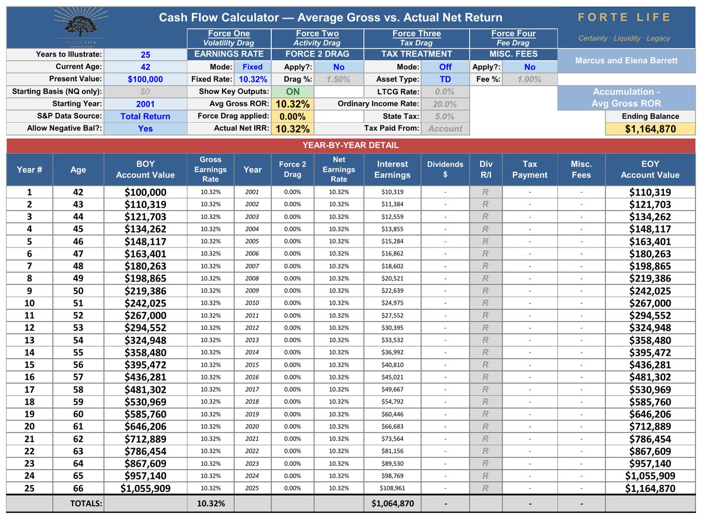
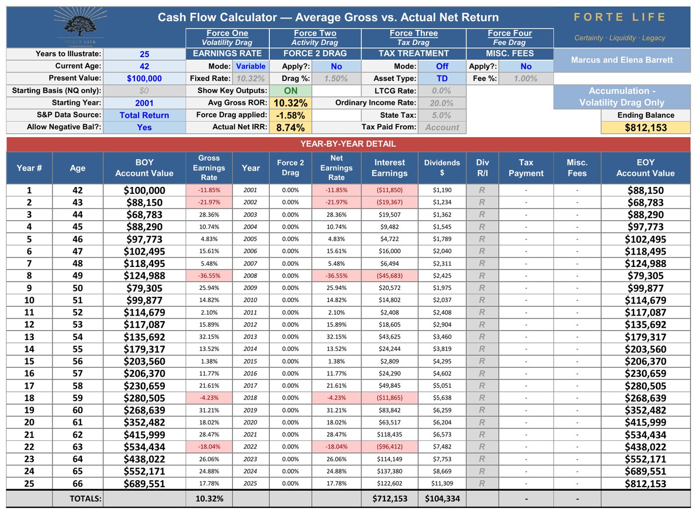
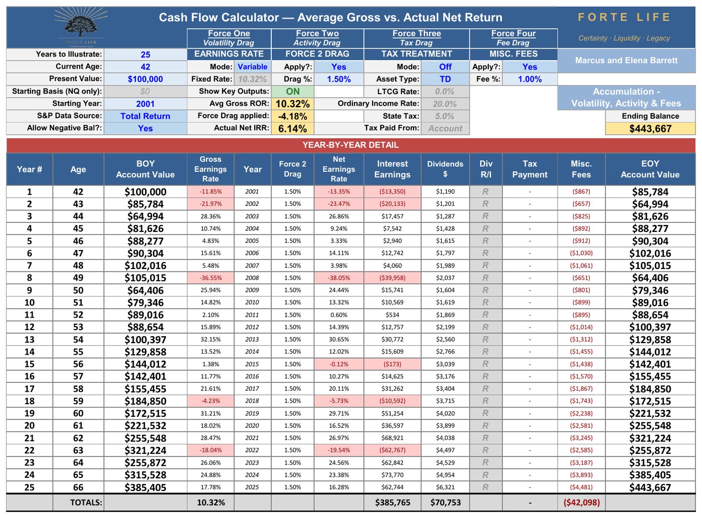
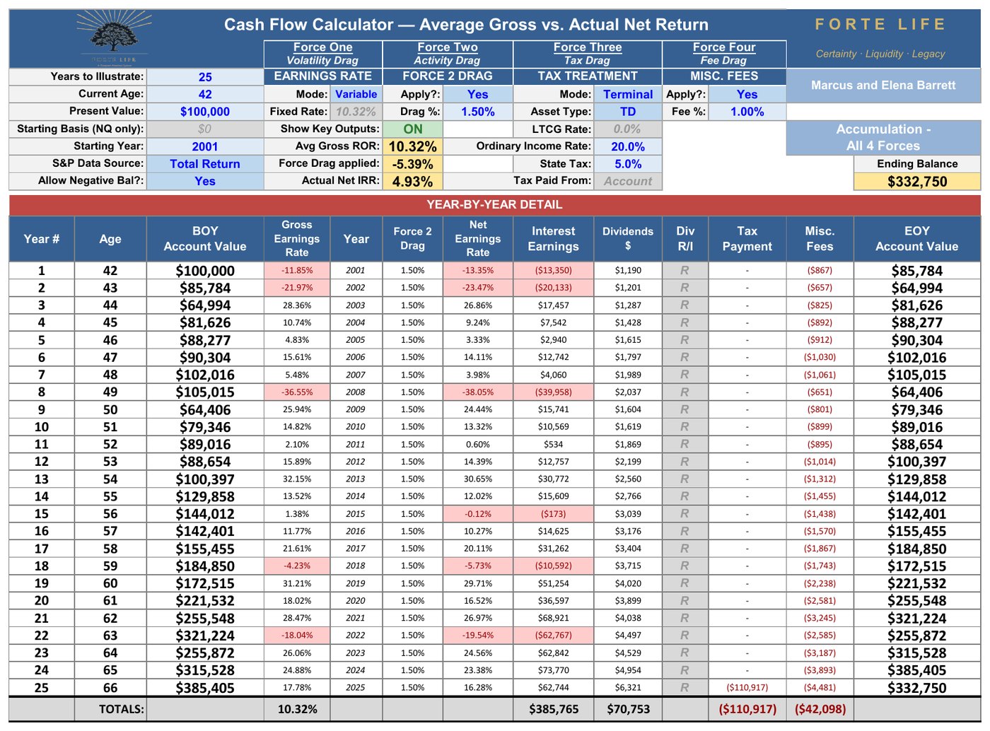
Follow the cascade, because every step is checkable. Wall Street projects the arithmetic average — 10.32% — which on $100,000 compounds to $1,164,870 over twenty-five years. But the market never delivered a smooth 10.32%; it delivered the actual, jagged sequence of 2001 through 2025, and that real sequence compounds to only 8.74% — $812,153. That first gap, more than $350,000, is Volatility Drag, and it needs no separate deduction: it is simply what the real returns did. Activity Drag brings the return to 7.21%; the 1% fee brings the pre-tax total to $443,667; and the 25% terminal tax on a tax-deferred account leaves $332,750 — an Actual Net of 4.93%.
Ten-point-three-two advertised. Four-point-nine-three kept. That is the anatomy of the gap in one real quarter-century — and to be clear, 2001–2025 was not a rigged example: its 4.93% net actually sits below the 6.40% median of the century’s seventy-six 25-year windows, meaning the typical outcome is somewhat kinder and the full range wider. Section 7 runs this identical cascade across all seventy-six of them, so the pattern can be seen whole rather than argued from a single case.
That is the point of the waterfall. The forces are not weather. They are climate.
6.2 What the Cascade Is Not
Sit with the first two rows of that table for a moment, because they hold a fact worth pausing on. Across 2001–2025, twenty of the twenty-five years were positive, and those twenty winners averaged 17.5% apiece. Only five years finished down. This was not a punishing quarter-century — it was a generous one, and it still produced a 4.93% Actual Net.
That is the argument of this paper in a single period of history: the compression is not caused by the bad years. It is caused by four forces working on every year, the good ones included.
Nor is the result an artifact of when the bad years happened to land. Reorder the twenty-five annual returns at random — put 2008 first, or last, or in the middle — and the ending balance does not change by a dollar. In pure accumulation with no contributions or withdrawals, the sequence of returns is mathematically irrelevant; multiplication is commutative. The $332,750 is a function of the returns themselves, the activity drag, the fee, and the tax treatment — never their order. (This is precisely what changes in retirement, where withdrawals make sequence the dominant risk. Section 11 takes that up.)
One figure worth isolating: hold everything else constant and remove only Activity Drag, and the same investor ends with $473,782 rather than $332,750 — an Actual Net of 6.42% instead of 4.93%. That $141,032 is the price of the two gaps described in Section 3: funds that trail their index, and the ordinary human timing of adding and withdrawing money. Neither requires the investor to have done a single thing wrong.
Every Window in History100 Years of Rolling Data
7.1 The Fair Objection
A fair skeptic should now raise the obvious objection: averages smooth things over, and single examples can be cherry-picked. Perhaps 2001–2025 was simply an unkind draw, and a different quarter-century would tell a friendlier story?
There is a direct way to find out. Take every 25-year window the century contains — all seventy-six of them, starting 1926, 1927, 1928, and every year through 2001 — and run each one through the same engine, with the same realistic investor: the ~1% all-in fee from Section 5, the Activity Drag from Section 3, the same tax-deferred terminal treatment. Not a simulation. Seventy-six actual quarter-centuries of American market history.
7.2 Summary Results
| Across all 76 windows | Actual Net IRR | $100K becomes |
|---|---|---|
| Worst window (1929–1953) | 1.46% | $143,751 |
| 10th percentile | 4.00% | — |
| 25th percentile | 5.45% | — |
| MEDIAN window | 6.40% | $472,014 |
| 75th percentile | 8.77% | — |
| 90th percentile | 9.77% | — |
| Best window (1975–1999) | 13.13% | $2,185,661 |
76 rolling 25-year windows, 1926–2001 starts, all four forces at the 1% all-in baseline, each run individually through the Cash Flow Calculator. The 2001–2025 window lands at 4.93% / $332,750 — identical to Section 6.2, as it must be.
7.3 Key Observations
Two things in that table deserve a long look. The first is the sheer width of the honest range: the same disciplined behavior, the same fee, the same tax treatment, and history handed one investor 1.46% and another 13.13% — purely by their birth year. Anyone who quotes you a single expected return has skipped this table. Periods launched near market bottoms (the early 1930s, the mid-1970s) produced exceptional outcomes not because of superior strategy but because of fortunate timing — and clients cannot control their starting point.
The second is the answer to the skeptic. In how many of the seventy-six windows did the four forces compress the market’s advertised average into a materially smaller Actual Net Return? Seventy-six. The gap between Average Gross and Actual Net was never smaller than 4.7 points, its median was 5.4 points, and it reached 7 points in the frothiest windows — where, notably, the compression was largest, not smallest. The gap is not a defect of a bad period. It is a structural property of every period the market has ever produced. The only question any given investor gets to ask is not whether the compression will happen — it is how much of it their plan is built to see, measure, and manage.
The 2001–2025 period — the primary accumulation window for many readers of this paper — produced a below-median result: 4.93% against a 6.40% median — in the bottom third of all historical outcomes.
The Forward OutlookVolatility Is Not Declining
8.1 The QE Anomaly
The 2010s produced the lowest volatility decade in 90 years of S&P 500 data (σ = 12.1%). This was not a natural market phenomenon. It was the product of unprecedented central bank intervention — quantitative easing programs that suppressed interest rates, reduced credit spreads, inflated asset prices, and dampened the normal volatility of market discovery.
Those conditions are over. The 2020s have already reverted to a σ of approximately 17.3% through 2025, and the structural factors driving this elevation are not cyclical. They are architectural.
8.2 Structural Drivers of Elevated Forward Volatility
US-China geopolitical decoupling — supply chain fragmentation, tariff escalation, and technology bifurcation create persistent uncertainty across global corporate earnings
Sustained military conflicts — Russia-Ukraine and Middle East instability with direct energy and commodity market impact
AI-driven creative destruction — rapid sector displacement cycles compressing the lifespan of competitive advantages
Historic US debt trajectory — $36+ trillion national debt with structural deficits creating policy constraint and long-term rate pressure
Post-QE rate normalization — the end of two decades of artificially suppressed volatility; markets must now price risk without the Fed safety net
Political polarization — domestic policy uncertainty amplified across election cycles reduces corporate investment confidence
Climate transition risk — physical and regulatory disruption to energy, insurance, and infrastructure sectors
Demographic headwinds — aging populations in major economies reducing consumption growth and labor force expansion
8.3 Likely Forward Volatility Range
Based on structural analysis and the historical precedent of periods with similar macro complexity (2000s: σ = 20.9%; 1970s: σ = 19.0%, measured from the 100-year series), the reasonable planning range for forward annual volatility is:
Conservative (low volatility) assumption: σ = 15%
Base case assumption: σ = 18–20%
Elevated scenario: σ = 22%+
The base case of 18–20% is significantly above the suppressed 2010s level and implies a volatility drag of 1.62% to 2.0% annually — in line with or above the 1.83-point gap the full century actually delivered (12.11% arithmetic vs. 10.28% compound, 1926–2025) — meaning forward geometric mean returns will likely be a larger discount to arithmetic means than historical averages suggest.
8.4 One Further Change in Conditions: The Direction of the Flow
One structural feature of the historical record deserves explicit mention, because it will not repeat. The century analyzed in this paper — and especially its final four decades — was accumulated into: the largest generation in American history spent forty years as a structural net buyer of equities, channeling paychecks into the market through the retirement-plan architecture built for exactly that purpose. That generation has now crossed into the distribution phase, where income needs and required minimum distributions make it a structural net seller for decades to come, with no equally large cohort of buyers behind it.
This is not a return forecast, and this paper makes none. It is one more documented reason the historical record should be treated as a record — not a promise. The consequences of this reversal fall most heavily not on accumulators but on those drawing income, where the order of returns becomes decisive — the subject of the companion Distribution analysis.
On Ranges, Odds, and What History Already Ran
Financial planning software typically answers the range-of-outcomes question with Monte Carlo analysis: generate thousands of synthetic return sequences from statistical assumptions, and report how often a plan survives. Used well, it is a legitimate tool, and in a live Retirement Income Plan it has a place — stress-testing a specific household’s withdrawals, timing, and accounts against many possible futures.
For the question this paper asks, though, a better dataset exists, and Section 7 already used it. A Monte Carlo engine must assume its way to an answer — someone chooses the average, the volatility, the shape of the randomness, and the output inherits every one of those choices. The seventy-six rolling windows assume nothing. They are not draws from a model of the market; they are the market — every 25-year experience the last century actually produced, each run through the same four-force engine, each traceable to a real sequence of real years. History has already run the simulation, and unlike a synthetic one, its worst case (1.46%) and best case (13.13%) both actually happened to somebody.
So this paper rests its range on the record rather than on randomness. What the record says is uncomfortable enough: a quarter of all windows netted under 5.45%, the worst delivered 1.46%, and no window — not one — escaped the four forces. When we build your individual plan, simulation takes its proper seat alongside this history. But the argument of this paper needs no simulated support: it happened seventy-six times out of seventy-six.
9.1 The Planning Recommendation
| Planning posture | Net IRR assumption | Basis (76 windows, all four forces \@1%) |
|---|---|---|
| Conservative (stress test) | 4.0–5.4% | 10th–25th percentile of history |
| Base case (central plan) | 6.4% | Median window |
| Favorable scenario | 8.8% | 75th percentile |
Projecting client plans using a fixed 10–12% gross return — which even the century’s own average could not net — represents a systematic overstatement of likely outcomes that will compound in harm when the client enters the distribution phase.
Evaluating Properly Structured Whole Life Insurance on Apples-to-Apples Terms
10.1 The Standard Comparison
The standard financial planning community comparison of whole life insurance to market alternatives focuses on internal rate of return. On a gross return basis, whole life cash value growth — driven by guaranteed interest plus participating dividends from a mutual life insurer — typically produces returns in the 4–6% range in early policy years, improving to 5–7% or higher in later years as the death benefit cost becomes a smaller proportion of total premium.
Compared to the 12.11% arithmetic-mean gross return of the S&P 500’s last full century (1926–2025), this appears dramatically inferior. This is the comparison most commonly cited in financial media and by fee-only advisors. As Section 6 of this whitepaper established, however, the 12.11% arithmetic mean is not a comparable figure to a net IRR from any instrument — and the proper comparison requires evaluating both instruments on the same net basis.
10.2 The Net-to-Net Comparison
The intellectually consistent comparison is net market return versus net whole life return — both evaluated on the same terms.
When properly structured whole life is evaluated after: - Policy costs (mortality and expense charges, administrative fees) - Tax treatment (cash value growth is tax-deferred; death benefit income-tax-free; policy loans tax-free) - Accessibility (cash value available without market penalty at any time) - Liquidity (no sequence risk, no market correlation, no forced sale at depressed prices)
The net, after-tax return on properly structured whole life from a participating mutual insurer has historically produced returns in the 4–6% net range. Sections 10.4 through 10.6 below quantify this comparison precisely for a specific illustration, with the gross-up math made explicit.
10.3 What “Properly Structured” Means
Not all whole life policies are equivalent. A policy designed for maximum death benefit — the traditional agent compensation model — is not the same instrument as a policy designed for maximum cash value accumulation. The distinction matters enormously.
A properly structured policy for accumulation and volatility buffer purposes: - Maximizes Paid-Up Additions (PUA) relative to base premium to accelerate early cash value growth - Uses a participating mutual insurer with a multi-decade track record of dividend payments - Is designed by an advisor with fee transparency and client-first incentive alignment - Is structured to minimize the death benefit relative to premium outlay within IRS guidelines (to avoid Modified Endowment Contract classification) - Is managed over time, not set and forgotten — the funding, dividend option, and loan activity are maintained across the life of the policy, not fixed once at issue
When these conditions are met, the policy becomes a unique financial instrument: contractual growth with a guaranteed floor, tax-advantaged, non-correlated to markets, accessible without penalty, and capable of serving several functions at once — among them a wealth accumulation vehicle and a volatility buffer in retirement.
10.4 A Properly Structured Illustration in Practice
The following figures are drawn from an actual illustration for Marcus, the husband of a hypothetical married couple — Marcus and Elena — both age 42 and both in excellent health. The policy is from a major participating mutual life insurance company and is a properly structured Accumulation Whole Life policy with maximum Paid-Up Additions. The policy is designed as a Non-MEC (not a Modified Endowment Contract), preserving favorable tax treatment on distributions.
A note on policy design strategy before reviewing the numbers: in real-world planning engagements with married couples, one of the key questions during plan design is whose life the policy should be issued on — the husband, the wife, or both with separate policies. Each approach has different implications for death benefit timing, premium structure, and legacy planning. For the simplicity of this section, the figures below reflect a single policy on Marcus. The figures for a single policy on Elena (also 42, also in excellent health) would look nearly identical. The decision to place a policy on one spouse, both spouses, or a layered combination is part of the coordinated planning conversation in a real engagement, not a question this analysis attempts to resolve in the abstract.
A note for readers in their 50s or older: the 25-year accumulation example presented below is not a requirement of the framework; it is an example. Readers closer to retirement should refer to Section 13.6, which presents the same policy under the Premium Offset Program with only 7 years of funding. The structural conclusions hold across a wide range of accumulation windows, and properly structured whole life can still fit the coordinated plan even when only 5 to 10 years of accumulation remain before retirement.
Policy parameters:
| Parameter | Value |
|---|---|
| Insured profile | Marcus — Male, age 42, Preferred Plus Non-Tobacco |
| Annual premium | $12,000 |
| Funding period | 25 years (ages 43–67) |
| Total out-of-pocket premium outlay | $300,000 (25 × $12,000) |
| Initial total death benefit | ~$251,264 |
| Dividend option | Paid-Up Additions (PUAs) |
| Income tax structure | Withdrawals to basis, then policy loans (entirely tax-free) |
Illustrated outcomes — based on the insurer’s current dividend scale (~6.00%):
| Outcome | Value |
|---|---|
| Income period | 25 years (ages 68–92) |
| Annual income | $38,000 (level — same every year) |
| Total tax-free income over 25 years | $950,000 |
| Cash value at age 67 (start of income) | $593,235 |
| Cash value remaining at age 92 | $44,709 |
| Net death benefit remaining at age 92 | $165,676 |
| Net death benefit at age 102 (end of illustration) | $107,579 |
Approximate Internal Rate of Return:
| IRR Basis | Approximate Rate |
|---|---|
| On income only (plus residual cash value at year 50) | ~4.85% tax-free |
| On income plus death benefit at end of income period | ~5.20% tax-free |
Translating to apples-to-apples market terms:
A 5.0% tax-free IRR is equivalent, on a tax-adjusted basis, to approximately:
6.7% pre-tax in a fully taxable scenario at a 25% combined effective tax rate
6.3% on a tax-deferred basis (after the 25% terminal tax modeled throughout this whitepaper)
However, these pre-tax conversions still understate the comparison, because the whole life policy’s net IRR is already calculated after all internal policy costs are absorbed. The market alternative, by contrast, has its own ongoing costs — investment management fees — that must be added back to make the comparison truly equivalent. As a standalone reference point, a 5.00% tax-free return is worth 6.22% pre-tax at the 25% terminal rate. But no additive chain is needed beyond that intuition: the requirement figures below are engine-solved — tax, activity, and fee are all inside the solve — and then restated in Average Gross terms by adding back the century’s measured volatility gap:
| Gross-Up Layer | Calculation | Equivalent Required Return |
|---|---|---|
| Whole life policy tax-free IRR (the outcome to match) | Base figure | 5.00% tax-free |
| Baseline required compound rate — engine-solved so that all four forces at the 1.0% all-in fee still net the policy’s 5.00% | — | 8.78% CAGR |
| Managed required compound rate — engine-solved at the 1.5%+ all-in fee | — | 9.33% CAGR |
| Baseline as Average Gross — add back the century’s measured volatility gap | 8.78% + 1.83% | ~10.61% Average Gross |
| Managed as Average Gross — same add-back | 9.33% + 1.83% | ~11.16% Average Gross |
The progression of figures in this table reflects two different ways of expressing the comparison. The 8.78% and 9.33% figures are CAGR (compound annual growth rate) figures — engine-solved rates at which the market portfolio must compound so that, after all four forces, it still nets the policy’s outcome. The final figures restate that requirement in Average Gross terms — the arithmetic mean of annual returns, which is how Wall Street typically quotes market performance — by adding back the century’s measured 1.83-point volatility gap. (Neither figure here carries a term insurance cost; Section 10.6 adds that layer where the buy-term comparison requires it.) That gap does not exist in the whole life policy, because every year of cash value growth is positive by contract (a contractually guaranteed interest rate of 2–4% depending on the carrier, with the excess dividend layered on top to produce the total dividend scale).
In practical terms: the realistic investor at the 1% all-in baseline must see an Average Gross of roughly 10.61% sustained for decades — with no sequence damage during income distribution — just to match what the whole life policy delivers contractually. The investor in a comprehensive managed account must see roughly 11.16%. Both figures sit inside the 10–12% headline range Wall Street quotes, which is exactly the point: matching the policy requires the market to actually deliver its brochure, every year, for a working lifetime.
And that requirement is not a formality history always cleared. Of the 76 quarter-centuries on record, 17 delivered less than the 10.61% the baseline investor requires, and 27 — better than one window in three — delivered less than the 11.16% the managed-account investor requires.
It is worth being precise about what this comparison does and does not show, because the honest version is more useful than the flattering one. It is tempting to stop at the rate and call the market the winner — but that grants the market its advertised return as a number someone actually keeps, the fiction Sections 5 through 7 dismantled. Measured honestly, on the net basis this paper demands of every instrument, the policy’s illustrated net return is 5.00% — and that figure is quoted at the carrier’s current dividend scale, which sits below 74% of its own 38-year history and which the illustration is required to hold flat for life, so it is far nearer a floor than a ceiling. Against the realized net distribution, that 5.00% sits between the 10th and 25th percentile of the 76 windows (p10 = 4.00%, p25 = 5.45%) — quoted, in other words, at close to the lowest the carrier’s record would suggest, against the market at its average.
Be precise about what that figure is, because the two sides of this comparison are not the same kind of number. The 5.00% is what this contract projects at the carrier’s current dividend scale, held flat for sixty years — an illustration is required to assume today’s scale never changes. The market’s distribution is a century of realized outcomes across every rate environment there has been. One number is pinned to this year. The other roams a hundred. Section 10.5 takes that asymmetry up in full.
Grant it anyway. That is not the argument, and rate is not the test. A retiree can win on rate and still run out of money at ninety; Section 10.7 shows precisely that. The argument is that the policy’s number is contractual while every figure in that distribution was drawn, unknowably, at birth — and the investor who needs the market to clear 10.61% has no mechanism to choose which window they get. One instrument delivers a defined outcome; the other delivers a lottery over history, in which seventeen of the seventy-six cards — better than one draw in five — would have failed to match the defined one. The case for coordination has never rested on the policy out-returning the market. It rests on what each instrument structurally provides — and on what happens when the accumulation years end and the money must actually be spent, which Section 10.7 takes up directly.
There is a practical reason to insist on this, and it is not modesty about the rate. A case built on out-returning something else is rented from the market's mood, and a good year takes it back. I have watched it happen: a client persuaded by a returns argument who cancelled a few years later, when the market cooperated and the comparison he had been sold no longer flattered the policy — though nothing about his plan had changed, only the story he had been told about why he owned it. Selling on rate hands the client a reason the next bull market can repossess. So the case here is built on what a good year cannot refute — what the money keeps, when it can be reached, and what it does across a whole life rather than a lucky stretch — and never on the claim that it beats anything.
A note on what is and is not guaranteed in the 5.00% IRR figure: The 5.00% tax-free IRR reflects the insurer’s current dividend scale, which itself is composed of two distinct components that deserve separate treatment.
The Dividend Scale on a participating whole life policy is the total gross growth rate credited to the cash value each year. It consists of two parts:
The Guaranteed Interest Rate — typically 2-4% depending on the carrier and contract. This rate is contractually locked in for the life of the policy. It cannot change — up or down — once the contract is in force. Every dollar of cash value receives this rate every year, by contract, with no dependence on the insurer’s investment performance, market conditions, or any other variable.
The Excess Dividend — currently approximately 3% on a Penn Mutual policy, representing the difference between the Guaranteed Interest Rate and the total Dividend Scale (6% currently). This is the non-guaranteed component, and it fluctuates with the insurer’s actual investment performance, mortality experience, and operating efficiency.
What this means for the 5.00% IRR: approximately half of the IRR is supported by the contractually guaranteed interest rate that cannot be reduced. The remaining portion comes from the excess dividend, which is technically non-guaranteed. Be precise about what “non-guaranteed” touches, because the word frightens people out of the category for the wrong reason: it does not mean the cash value can fall. Credited value is locked and the floor only rises; the non-guaranteed element applies solely to each future year’s excess dividend — whether it is paid, and how much. A lower dividend means the cash value grows a little more slowly that year, never that it declines. Only the rate of future growth on the excess portion is ever at risk — never a dollar of cash value already built. The relevant question for planning purposes is how reliable the excess dividend component has been historically.
The empirical record is striking. The major participating mutual insurers used in properly structured Accumulation Whole Life policies — companies like Penn Mutual (founded 1847) and MassMutual (founded 1851) — have paid an excess dividend on top of the guaranteed interest rate in every single year of their corporate existence. Penn Mutual has paid both the guaranteed interest and an excess dividend for 178 consecutive years. MassMutual has paid both for 158 consecutive years. This record includes the Civil War, the Great Depression, both World Wars, the 1970s stagflation period, the 2008 financial crisis, and the COVID pandemic.
The accurate planning framing is therefore: the guaranteed portion of the 5.00% IRR is contractually locked in and cannot be reduced regardless of market conditions or insurer performance. The non-guaranteed portion has been paid every year for 150+ years through every major economic disruption in American history. While the non-guaranteed component could theoretically be reduced or eliminated, the empirical track record of uninterrupted excess dividend payments through every major crisis in modern history makes this outcome substantially less likely than the conventional “non-guaranteed” language suggests. The 5.00% IRR is more reliable than most market projections that are presented as “expected returns” — because half of it is contractually guaranteed and the other half rests on 150+ years of empirical payment history.
The comparison does not end there. The policy also provides:
Tax-free income for 25 years, immune to future tax rate increases
Zero sequence-of-returns risk on the underlying cash value
A non-correlated capital reserve that can serve as a volatility buffer for the market portfolio
A meaningful residual death benefit even after 25 years of income distributions
Contractual guarantees on the entire cash value (the guaranteed interest rate applies to both Base Cash Value and PUA Cash Value)
None of these features exist in a market-based portfolio. When all are accounted for, the apples-to-apples comparison is materially more favorable to the policy than the raw IRR comparison suggests.
10.5 The Asymmetric Illustration Assumption
There is one further consideration that is rarely discussed in financial planning conversations and that meaningfully changes the comparison between insurance and market projections: insurance illustrations are required to be conservative, while market projections are conventionally optimistic.
Insurance illustrations must use the insurer’s current dividend scale as if it never changes for the entire 60+ year projection period. Market projections, by contrast, typically use long-term historical averages (10–12% gross) as a forward assumption — averages that are not guaranteed and frequently fail to materialize over multi-decade periods, as Section 7 of this whitepaper documents in detail.
Consider the historical dividend interest rate of a representative major participating mutual insurer since 1989:
| Period | Dividend Interest Rate Range |
|---|---|
| 1989–1994 | 9.20% – 9.93% |
| 1995–2003 | 6.48% – 8.50% |
| 2004–2018 | 5.74% – 6.34% |
| 2019–2026 (current) | 5.75% – 6.34% |
The illustration discussed in Section 10.4 uses a current dividend scale of approximately 6.00%. Measured against the carrier’s own published history from 1989 through 2026 — thirty-eight years — the arithmetic mean of the annual dividend interest rate is 7.07% and the median is 6.34%. Six of those thirty-eight years credited less than 6.00%; four credited exactly 6.00%; and twenty-eight — seventy-four percent of the published record — credited more than the scale this illustration is required to assume, unchanged, forever. The policy’s projected outcomes would be materially better under a dividend scale anywhere near its own long-run average. As interest rates have begun normalizing from the post-2008 zero-interest-rate era, dividend scales at major mutual insurers have started rising again, which is consistent with how mutual life insurance economics historically respond to higher prevailing rates.
The implication is meaningful for planning purposes. The whole life policy as illustrated provides a conservative baseline. If dividend rates revert toward their long-term historical average (which has frequently occurred over multi-decade periods, particularly during rising rate environments), the policy’s actual results will exceed the illustration. The illustration sets a floor, not a ceiling.
By contrast, a market projection at 10–12% gross becomes meaningfully worse if forward returns disappoint — which the historical range analysis in Section 9 shows is a real probability given elevated forward volatility and current valuations. The market projection sets an optimistic target, not a conservative floor.
This asymmetry is a factor that often receives less attention than it deserves in the insurance vs. market comparison. When a properly structured whole life policy delivers its illustrated outcome, it is meeting an intentionally conservative bar set at the lower end of historical experience. When a market-based plan is projected at a 10% gross return, it is being asked to clear an intentionally optimistic bar at the higher end of historical experience.
The implication for planning purposes is that the policy illustration and the market projection are not equivalent reference points and should not be compared as if they were. The whole life illustration represents a conservative baseline that the policy is structurally designed to exceed in favorable conditions. The market projection represents an optimistic target that the portfolio is statistically more likely to fall short of than to exceed. This asymmetry should be disclosed to clients when comparing the two instruments, rather than allowed to operate silently in favor of the more optimistic figure.
10.6 Buy Term and Invest the Difference — A Direct Comparison
The most common critique of whole life insurance, frequently advanced by commission-free advisors and personal finance personalities, is the “buy term and invest the difference” argument. The thesis: term life insurance is dramatically cheaper than whole life, so the rational consumer should buy inexpensive term coverage to protect their family during working years and invest the premium savings in the market for higher returns. On its face, this argument is mathematically appealing. Examined carefully, it falls apart on three separate grounds.
Layer 1: The cost of term insurance must be loaded into the market comparison.
The whole life policy in Section 10.4 provides death benefit coverage that starts at $251,264, grows to a maximum of approximately $1,032,395 by age 67 (the end of the funding period), and gradually decreases as income is taken in retirement. A 20-year level term policy purchased at 42 covers policy years 1 through 20 — from age 42 to age 62. Across exactly that window, the policy’s net death benefit averages $546,000, rising from $276,815 in the first year to $842,690 in the twentieth.
To replicate that protection in a “buy term and invest the difference” strategy, Marcus would need to purchase a 20-year level term policy. A $546,000, 20-year level term policy at his profile — age 42, best health class — costs $452 per year. Over the 20-year coverage period, the total term insurance cost is $9,040.
This cost is real and must be subtracted from the market portfolio’s growth — or, equivalently, added back to the required gross return the market portfolio must generate to match the whole life outcome. On a $300,000 total premium outlay across 25 years (average balance ~$150,000), $452 per year represents an annual drag of approximately 0.30 percentage points on the market portfolio’s growth.
The fully loaded comparison table now reads:
| Comparison Component | Baseline Investor (1% all-in) | Managed Account Investor (1.5%+ all-in) |
|---|---|---|
| Whole life tax-free IRR (target to match) | 5.00% | 5.00% |
| Required compound rate — engine-solved, with volatility sequence, activity, tax, and fee all inside the solve | 8.78% | 9.33% |
| Plus term insurance cost (the “buy term” leg) | +0.30% | +0.30% |
| Required CAGR to match policy | ~9.08% | ~9.63% |
| Plus the century’s measured volatility gap — restating as Average Gross (arithmetic mean) | +1.83% | +1.83% |
| Required Average Gross to match policy | ~10.91% | ~11.46% |
The final row converts the CAGR requirement into the Average Gross (arithmetic mean) terms Wall Street typically uses when pitching market performance. The whole life policy does not require this conversion because its growth is contractually positive every year — there is no gap between the policy’s Average Gross and its Actual Net. The policy also does not require fifty years of well-timed decisions — the cash value grows contractually regardless of what happens in the market or in the policyholder’s life during those cycles.
The buy-term investor at the realistic 1% baseline must see an Average Gross of approximately 10.91% sustained for decades — with no sequence damage on income, no behavioral slippage beyond the measured averages, and continuous term coverage — just to match the contractually defined outcome of the properly structured whole life policy; the managed-account version of that investor must see approximately 11.46%. Measured against the actual record — and both figures here include the term insurance cost, unlike Section 10.4’s: 22 of the 76 historical quarter-centuries delivered less than the 10.91% Average Gross the buy-term baseline requires, and 33 delivered less than the 11.46% its managed-account version requires. The complete comparison is clear: the buy-term-and-invest investor is not choosing a sure thing over an insurance product — they are drawing a window from history’s deck, where between roughly three in ten and better than four in ten of the cards on record would have left them short of what the policy delivers with certainty.
Layer 2: Term insurance expires — and expires at exactly the wrong time.
The most damaging flaw in the “buy term and invest the difference” strategy is structural: the 20-year term policy purchased at age 42 expires at age 62. The client is now five years from retirement with zero life insurance protection.
Term insurance for a 62-year-old version of Marcus is substantially more expensive than at 42 — and substantially harder to obtain. The same $546,000 of 20-year level term coverage, at 62 and at the best available health class, costs $3,497 per year: nearly eight times the $452 he paid at 42.
But price is the smaller half of the problem. A 30-year term — the coverage that would carry him to 92, as the policy does — is not offered at that age at all. Shorter terms cost less and expire sooner: $2,539 a year buys fifteen years, to 77; $1,906 a year buys ten, to 72. The coverage does not merely get more expensive. It gets shorter.
And every figure above assumes he still qualifies for the best health class at 62. That is a far harder assumption than it was at 42, because two decades of accumulated medical history is precisely what underwriting examines. Many 62-year-olds will not qualify at the best rates. Some will not qualify at any price, and for them the replacement does not exist to be bought. The “buy term and invest the difference” strategy depends on the investor’s ability to keep replacing expiring coverage — and it is exactly at the ages where coverage matters most that the price rises, the term shortens, and the door begins to close. The dollars alone understate it.
The whole life policy, by contrast, maintains substantial death benefit protection throughout the income distribution years and into late old age. At age 92 — the end of the illustrated income period — the policy still carries $165,676 of net death benefit, with no premium being paid since age 67.
Layer 3: The strategy fundamentally misallocates capital across the volatility buffer requirement.
Even setting aside the cost and expiration problems, “buy term and invest the difference” has no mechanism to address sequence of returns risk in retirement. The entire retirement income portfolio is market-correlated. A down year early in retirement forces liquidation of depreciated shares to fund income needs — the exact scenario that destroys retirement portfolios and that the volatility buffer strategy is designed to prevent.
The whole life policy’s cash value, by contrast, is non-correlated to markets and provides exactly the buffer capital required to fund 2–4 years of income needs in the years after a market loss, while the equity portfolio recovers. This structural function — not just the return calculation — is what makes properly structured whole life a genuinely different financial instrument than term insurance plus a brokerage account.
Summary: the structural critique of “buy term and invest the difference”:
The strategy works mathematically only under three assumptions: (1) the market portfolio achieves above-median historical returns net of all costs including term insurance, (2) the investor actually invests the “difference” every year for decades rather than absorbing it into household spending — which industry data suggests is rarely sustained in practice, and (3) the investor does not need life insurance protection in retirement, or can secure replacement coverage at acceptable cost when initial term coverage expires.
The whole life alternative requires fewer favorable assumptions. The illustrated outcome is contractually defined rather than market-dependent. The Premium Offset Program removes the need for continued funding decisions after year 5–7. Death benefit protection continues into late life without renewal risk. The comparison is therefore not between “term insurance plus market” and “whole life insurance” as equivalent options with different return profiles. It is between two architectures with different structural assumptions about what must go right for the plan to succeed.
In a favorable run of returns, the term-plus-market approach can end accumulation with the larger balance — a bigger pile at sixty-seven. That is the most it can claim, and the argument concedes it freely. A bigger pile does not settle the outcome that follows: term-plus-market carries no second source to draw from in the years after a loss, no protection against the sequence that can empty an account at ninety, and no legacy that completes on time. Across the range of futures a household might actually get — not the friendly one it hopes for — the coordinated approach produces the better outcome, and it is the only one of the two that does not depend on which sequence arrives.
10.7 Accumulation Is the Second Act
Everything in this whitepaper to this point has compared a single property of two instruments: the rate at which money grows. That comparison has been run honestly, on a hundred years of data, and Section 7 reported what it found — a net distribution with a median of 6.40%, with the policy’s illustrated 5.00% sitting inside its lower quartile. Even that comparison flatters the market, because the policy’s number is quoted at a dividend scale below 74% of the carrier’s history and held flat for life — close to its lowest plausible case — while the market’s is drawn from a century of realized outcomes no investor could choose among.
It is a fair comparison. It is also, on its own, close to meaningless. Money saved is not an end in itself. It is saved in order to become income, and what remains at the end becomes legacy. A rate of accumulation is a measurement taken in the middle of a story whose ending nobody has looked at.
So look at the ending.
#### 10.7.1 Two Retirees, Both Sixty-Seven
One holds $1,000,000 in a traditional 401(k). The other holds $593,235 of cash value in a properly structured whole life policy. How either arrived there is a separate question; set it aside entirely. The only question now is what each asset can do.
Put them on the same footing first. A million-dollar tax-deferred balance is not a million dollars. Every dollar of it — contributions included — comes out as ordinary income, and at the 25% rate used throughout this paper, what the retiree actually owns is $750,000. The policy’s cash value is already tax-free. Net for net, the policyholder stands at sixty-seven holding 20.9% less money.
Here is what each one delivers.
| At age 67 | 401(k) | Whole Life Policy |
|---|---|---|
| Balance | $1,000,000 | $593,235 |
| Net of tax — what is actually owned | $750,000 | $593,235 |
| Annual income drawn | $48,000 | $38,000 |
| Spendable, after tax | $36,000 | $38,000 |
| Payout rate on net balance | 4.80% | 6.41% |
| Full years of income delivered | 23 | 25 |
| Remaining at age 92 | $0 | $44,709 cash value |
| Death benefit at age 92 | $0 | $165,676 |
The 401(k) draws $48,000 a year — a 4.8% withdrawal, a figure most planners would call prudent. Taxed as ordinary income, $36,000 of it reaches the retiree. Run against the actual 2001–2025 market and carrying the same 1.5% Activity Drag and 1% all-in fee this paper has applied from its first page, that account delivers twenty-three years of income and is exhausted in year twenty-four, at age ninety. The last two years never arrive. Nothing passes to anyone.
The policy pays $38,000 a year, tax-free, for all twenty-five years. That is a 6.41% payout rate against the market account’s 4.80% — nearly a third higher. Over the period it distributes $950,000. And at ninety-two, having paid out nearly a million dollars, it still holds $44,709 of cash value and $165,676 of death benefit. One dollar, two jobs: the same capital produced the income and the legacy, and neither was traded for the other.
Twenty percent less money. More spendable income — $38,000 against $36,000. Twenty-five years of it instead of twenty-three. And a legacy the larger asset could not leave.
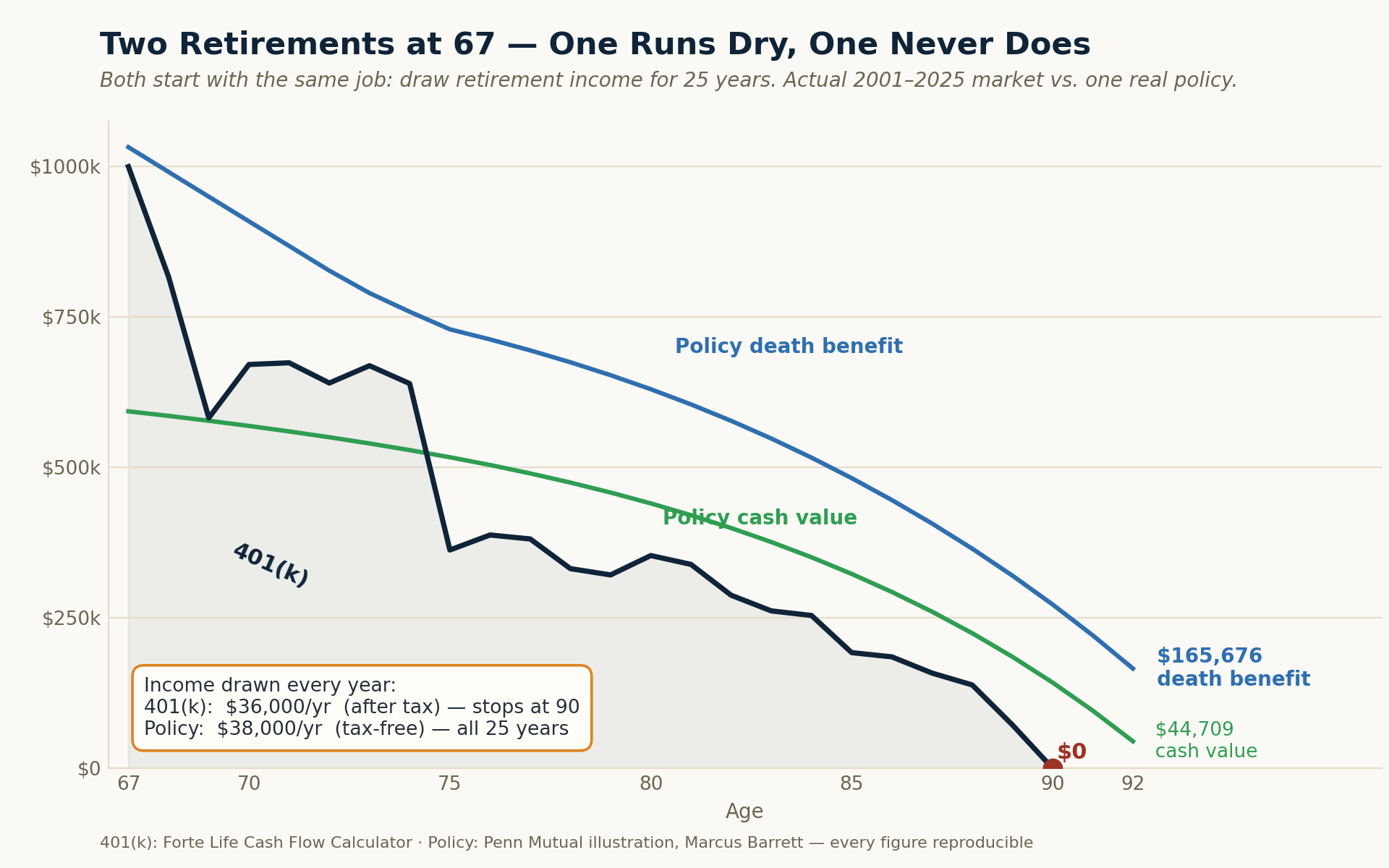
The navy line is the 401(k) — it hits zero at ninety. The policy's cash value (green) and death benefit (blue) never do, and it pays more, tax-free, the whole way. The complete year-by-year 401(k) schedule behind the navy line — the actual Cash Flow Calculator run — is reproduced in Appendix A.
#### 10.7.2 What the Market Was Asked to Do
Section 10.4 established what the market portfolio must produce to match the policy: an Average Gross of 10.61% at the realistic 1% all-in fee, or 11.16% in a comprehensive managed account. Those figures are easy to read as neutral benchmarks. They are not. They are demands.
A demand for 10.61% is a demand that the market perform — not once, not in a good decade, but sustained across the whole of a working life, with no ability to choose which twenty-five years one is born into. The historical record is the arbiter of whether that demand is reasonable, and the record is unambiguous: seventeen of the seventy-six quarter-centuries on file delivered less than 10.61%. Twenty-seven — better than one in three — delivered less than 11.16%.
The investor cannot select their window. They receive it.
#### 10.7.3 What the Policy Was Never Asked to Do
Now ask the question this whitepaper never asked: what rate must the policy earn?
It has no such requirement. The 5.00% is not a hurdle the contract strains to clear; it is what the contract pays. There is no window to draw, no sequence to survive, no assumption that must hold.
Which raises the obvious objection: how can a 5.00% instrument stand against an 11.16% requirement at all?
Because those two numbers are not doing the same work. Of every dollar the market earns, a share is lost to volatility, a share to the funds and the timing, a share to fees, and a quarter of whatever survives to tax — and the dollars that finally reach the retiree convert to income at 4.80%, taxable, with a real possibility of running out. Of every dollar the policy credits, all of it stays, and it converts to income at 6.41%, tax-free, without depleting, with a death benefit still standing behind it.
The market must earn a great deal more because it keeps a great deal less.
That is the whole of it. The efficiency at the far end — how much income a dollar of an asset can safely produce, and for how long — is what removes the need for performance at the near end. The policy was never asked to stretch, because it never had to make up for what it lost along the way. And a comparison that examines only accumulation rate cannot see any of this. It measures the growing and never asks what the growing was for.
#### 10.7.4 Grading the Second Act
Nothing here contradicts Section 7. Most quarter-centuries did beat 5.00% on accumulation rate. That was never the point, and treating it as the point is precisely the error this section exists to name.
A retiree can win on rate and still run out of money at ninety. The rate at which an asset grows and the income it can safely deliver are different properties, and neither of them is a legacy. To judge two instruments on accumulation rate alone — the only chapter this whitepaper has examined — is to grade a three-act play on its second act.
Note carefully what the exhibit in 10.7.1 does not explain. It shows that the market account, drawing a prudent 4.8% through an ordinary quarter-century, was exhausted at age ninety. It does not explain why. The reason is a mathematical property that does not exist during accumulation at all — one this paper has explicitly set aside, and that reverses everything proven in Section 6.2 about the irrelevance of sequence. It is the subject of the companion analysis, and it is the single most consequential fact in retirement income planning.
The accumulation phase asks: how much can I gather? The distribution phase asks a harder question: how much of it can I actually spend, and for how long, and what happens to the rest? A plan built to answer only the first will discover the second on its own terms.
The Volatility BufferWhy Uncorrelated Capital Changes Everything
11.1 The Core Problem in Distribution
The accumulation phase analysis in this whitepaper has documented a significant but manageable problem: the gap between projected and actual returns means clients accumulate less than they expect.
The distribution phase introduces a structurally different and more dangerous problem: sequence of returns risk. In accumulation, we proved mathematically that the order of annual returns is irrelevant — the same set of returns, in any sequence, produces the same ending balance. In distribution, this is false. The order of returns becomes the dominant variable in determining whether a portfolio survives or fails.
A detailed analysis of the distribution phase — with full mathematical modeling of sequence risk using actual historical return sequences — is the subject of the companion analysis. What follows is a framework introduction.
11.2 Why Sequence Risk Is Catastrophic Without a Buffer
The mechanism does not require a crash to do its damage; an ordinary down year is enough. Consider a retiree drawing $48,000 a year from a $1,000,000 portfolio — a 4.8% withdrawal, the kind most planners would call prudent — who meets a 15% decline, a fall well within the range of a normal year.
The $1,000,000 falls 15% to $850,000.
The $48,000 of income still has to come out, leaving $802,000.
To climb back to the $1,000,000 it started at, that $802,000 must now gain 24.7% — not the 15% it lost. And if the next year's income is drawn before the recovery is complete, the hole is deeper still.
That is the asymmetry at the heart of sequence risk. A dollar withdrawn in a down year is a dollar sold at a discount, and it is gone — it is not there to participate in the recovery when it comes. In accumulation, a down year is a paper dip that time repairs. In distribution, the same down year, met with the same withdrawal, is a permanent subtraction from every year that follows. The shares sold low never recover. The portfolio is structurally smaller for the rest of the retirement — and none of it required a catastrophe. It required only an ordinary bad year arriving while money was being drawn. The sequence that produced a fine accumulation outcome produces a failing one in distribution, at the very same average return.
11.3 The Buffer Strategy
The volatility buffer addresses this problem directly. A coordinated plan needs three to five years of income in a source that does not fall when the market falls, so that the client is never forced to sell the market portfolio at depressed prices to fund income. Cash value can supply it — while it goes on doing everything else in this paper.
Three to five years is not a rule of thumb. Across all seventy-six rolling twenty-five-year windows of the last century, the longest unbroken run of down years had a median of two and a maximum of four: the four consecutive years from 1929 through 1932. A three-year buffer covers the longest run in seventy-two of the seventy-six windows; four years covers all seventy-six. The remainder of the range is margin, not a figure the record demands.
The reason the number is small enough to be achievable is that a buffer is not sized by how many down years a retirement contains. A typical twenty-five years holds about six. It is sized by the longest unbroken run of them.
The mechanics: 1. A market loss occurs — and that year’s income has already been drawn from the portfolio, because no one knows in advance how a year will end. 2. The following year, once the loss is a fact, income is drawn from whole life cash value instead. 3. The market portfolio is left untouched, so the recovery works on the full balance rather than one that withdrawals have further reduced. 4. Portfolio withdrawals resume once it has recovered.
This non-correlation has a second dimension that a rate comparison never captures. Properly structured policy income does not enter the MAGI figure that governs the income-tested thresholds of retirement: how much of a retiree’s Social Security becomes taxable, and whether they cross into the IRMAA surcharges that raise Medicare Part B and Part D premiums for higher-income beneficiaries. A taxable withdrawal of the same spendable amount can trigger both — and, notably, so can income from many assets commonly called “tax-free,” such as municipal bonds, whose interest remains inside the MAGI calculation. Properly structured policy income does not. “Non-correlated,” in other words, means non-correlated to tax-rate risk, not merely to market volatility — the mechanics of which the companion Distribution analysis takes up in full.
This strategy, combined with a guaranteed income foundation (such as an income annuity covering baseline non-discretionary expenses), transforms the distribution phase from a sequence-risk minefield into a manageable, sustainable income system.
The mathematical impact on portfolio longevity — how many additional years of sustainable income the buffer strategy provides — is documented in the companion distribution phase analysis.
The Distribution PhaseA Preview
This whitepaper covers the Accumulation phase of the retirement income framework in full. The Distribution-phase companion analysis — covering what happens after retirement begins, when the same forces analyzed in Sections 1 through 10 interact with active income withdrawal — is the natural next step for any reader who has internalized the conclusions presented here.
The Distribution companion series follows the same three-tier structure as the Accumulation series: a short Article serves as the funnel entry point, an Executive Brief provides a 10- to 15-minute condensed analysis, and a full Whitepaper documents the rigorous mathematical and historical analysis. The Distribution series will cover:
Side-by-side modeling: average gross return assumption vs. actual year-by-year returns in distribution
The mathematical proof of sequence risk and why it does not exist in accumulation
Historical worst-case sequences for a retiree beginning withdrawals (2000, 2007, 1929 start years)
The breakeven analysis: how many years earlier does a portfolio fail under realistic returns vs. projected returns?
Income annuity design: how to determine the correct guaranteed income floor
Whole life as volatility buffer: sizing the cash value reserve correctly
Combined strategy modeling: probability of plan success with and without buffer in place
The planning conversation: how to present these realities to clients without alarming them unnecessarily
The Accumulation framework presented in this whitepaper establishes what to build. The Distribution framework presented in the companion series demonstrates what that build accomplishes when it matters most — through the years of active retirement when sequence-of-returns risk is the dominant variable and when the difference between a plan that includes a volatility buffer and one that does not becomes mathematically visible.
Beyond the Accumulation and Distribution analyses, there is a third body of work that deserves explicit naming. This whitepaper has focused on properly structured whole life as a return-comparable investment vehicle and as a volatility buffer for retirement income. But the policy’s cash value is doing something else throughout its life — something that is genuinely difficult to quantify but arguably more valuable than anything captured in an IRR calculation. The cash value is a living asset that the policyholder can use during their lifetime in ways no other financial instrument permits. It continues to compound without interruption, regardless of how it is being used. It can be borrowed against — at any age, for any purpose, with no qualification, no application process, no underwriting — while the underlying cash value continues to grow during the life of the loan. It funds business opportunities, real estate purchases, college tuition, family help, and major life decisions in ways that no 401(k), IRA, or brokerage account can match without triggering taxes, penalties, market timing risk, or sequence risk.
This is the conceptual territory of what we call The Living Asset Strategy — a forthcoming body of work that explores what a properly structured whole life policy enables the policyholder to do during their lifetime, the dual-use capital mechanics that make one dollar function as two, and the economic value of the certainty and optionality the contract provides. The argument extends beyond return calculations into what the capital does while it is held — more than a death benefit, a living asset. The Living Asset Strategy is a separate funnel rather than a section within this whitepaper because the argument deserves its own analytical foundation and its own conceptual center of gravity.
Readers should also be aware that beyond the written content in all three series, an interactive presentation and a series of detailed prerecorded videos walk through specific scenarios with actual numbers — with the ability to schedule a Capital Coordination Session — a focused, one-on-one session built around the reader’s actual numbers — when they are ready to discuss their specific situation.
Anticipated Critiques and the Complete Analysis
A whitepaper of this nature invites scrutiny — and should. The analysis presented here challenges conventional financial planning wisdom and arrives at conclusions that differ from those advanced by many in the fee-only advisory community, the personal finance media, and the broader market-investing orthodoxy. Intellectual honesty requires that the strongest forms of those objections be addressed directly, that legitimate critiques be conceded where they apply, and that the reader be given a complete picture rather than a one-sided argument.
In this section we steelman seven of the most common critiques that a sophisticated reader — a fee-only fiduciary advisor, a Boglehead-style passive investor, or a personal finance professional skeptical of cash-value life insurance — would raise against the analysis in Sections 1 through 11. Each is examined on its merits.
13.1 Critique: The 1% baseline overstates fee drag for disciplined do-it-yourself investors
The critique: A disciplined investor at Vanguard, Fidelity, or Schwab can hold a broad-market index fund for three to seven basis points and manage it themselves with no advisor at all. By treating roughly 1% all-in as the baseline, the analysis overstates fee drag by an order of magnitude for the most cost-conscious do-it-yourselfer. For that investor the real fee is closer to 0.05%, and their net outcomes are better than a 1% baseline implies.
Response: For that specific investor the critique is correct, and the analysis says so directly: Section 5 credits the fund-level floor explicitly, showing that a 0.05% expense ratio costs roughly $7,568 over 25 years — a rounding error, exactly as it should be. That investor is real. They are also a small minority.
Industry data consistently shows the median U.S. investor pays 0.75% to 1.50% a year once advisory charges, fund expenses, platform fees, and trading costs are aggregated — and this paper is written for the typical advised pre-retiree, not the rare self-directed exception. Against that reality a 1% baseline is generous, not punitive; it sits at or below what most advised investors actually pay all-in. And the disciplined do-it-yourselfer does not escape the analysis in any case — they still face volatility, activity, and tax drag undiminished. The fee is simply the one force they have managed to shrink, and Section 5 gives them full credit for it. What the 1% baseline refuses to do is build a retirement projection on the assumption that the reader is the exception rather than the rule.
Readers who are confident they will maintain an ultra-low-cost, self-managed index portfolio for the entire accumulation and distribution period should adjust the analysis accordingly. For the broader population to whom retirement income planning applies, the figures presented here are accurate or conservative.
13.2 Critique: The 25% terminal tax model overstates retiree tax burden
The critique: Real retirees do not pay 25% on their entire balance in year 25. They withdraw gradually over 25–30 years of retirement, paying ordinary income rates on each withdrawal — which, combined with the standard deduction, lower marginal brackets early in retirement, strategic Roth conversions, and tax-loss harvesting during accumulation, produces an effective tax rate closer to 15–18% than 25%. The whitepaper’s modeling is therefore unfavorable to the market case.
Response: This critique assumes static tax law and static income needs over a 25–35 year retirement period. Both assumptions are difficult to defend given the structural fiscal trajectory of the United States.
In 2015–2016, when the Tax Cuts and Jobs Act framework was being implemented, the U.S. national debt stood at approximately $19.57 trillion. As of 2026, the national debt has nearly doubled to approximately $37 trillion in roughly a decade. Federal interest payments now exceed defense spending. Structural deficits in Social Security and Medicare are projected to widen substantially over the next 15–20 years as the demographic curve continues to age. The mathematical reality is that current tax rates are not financing current spending; they are financing it via increased debt.
Historical context further weakens the “low-tax retirement” assumption. The top marginal federal income tax rate has been:
94% during World War II (1944)
91% throughout most of the 1950s
70% as recently as 1980
39.6% as recently as 2017
37% today (near historic lows)
A retiree planning for 30+ years of retirement under the assumption that today’s near-historic-low tax rates will persist for the entire period is making a substantial bet against historical precedent and current fiscal trajectory.
Additionally, inflation-driven bracket creep is a real phenomenon. Tax brackets adjust for CPI, but Social Security cost-of-living adjustments and retirement income needs often rise faster than CPI in practice. A retiree drawing $80,000 of effective annual income today may need $130,000–$140,000 of nominal income within 15–20 years to maintain equivalent purchasing power — pushing them into higher tax brackets in real terms even if statutory rates remain unchanged.
The 25% combined effective rate used in this analysis is defensible as a forward planning assumption and is arguably conservative given the structural pressure on future tax policy. Readers who believe future effective rates will be lower may adjust the modeling accordingly. Readers who believe future rates will be higher — a position with substantial historical and fiscal support — should consider that the tax-free nature of properly structured whole life income becomes more valuable, not less, in that scenario.
13.3 Critique: Whole life policy costs are not disclosed
The critique: The whitepaper celebrates the policy’s net IRR but never discloses what the policy’s internal costs actually are. Whole life insurance has substantial costs — agent commissions (often 50–100% of first-year premium), mortality costs, administrative expenses — that the whitepaper conceals while requiring the market case to display all of its costs explicitly.
Response: This critique conflates two different cost-disclosure conventions and treats the conflation as if it indicated concealment. Examined carefully, the difference is structural rather than ethical.
The structural difference is real: market-based product costs are charged as a percentage of the account balance and are therefore visible as a separately itemized line on every statement. Whole life insurance costs are paid from premium inflow, are front-loaded into early policy years, and are netted into the cash value and dividend figures shown in the policy illustration. The IRR figures presented in Section 10 are net figures — net of every internal policy cost, mortality charge, and administrative expense.
The empirical proof of cost structure adequacy is the 200-year track record of mutual life insurance. Major participating mutual insurers have paid dividends every year for well over a century — including through the Great Depression, two world wars, multiple recessions, the 1970s stagflation period, the 2008 financial crisis, and the COVID pandemic. This persistency record is impossible if the underlying cost structure were unsustainable.
The legitimate observation underneath this critique is that the disclosure conventions are different and that a fee-aware audience may want to understand what is happening inside the policy. This is a fair point. In summary: a properly structured whole life policy from a major mutual insurer typically allocates approximately 60–70% of total premium dollars over the policy’s life to cash value accumulation, with the remaining 30–40% covering insurance protection costs, administrative expenses, and operational margins. These costs are heaviest in the first 1–3 years and decline substantially thereafter. The net IRR figures presented in this whitepaper reflect this structure as it actually performs.
What this whitepaper does NOT do is compare the gross return of the policy’s underlying general account portfolio (typically 5–6% in current conditions) to the gross return of the S&P 500. That comparison would be misleading in the opposite direction. The honest comparison is net to net — which is precisely what has been presented.
13.4 Critique: Whole life is illiquid in early years
The critique: The cash value of a whole life policy in years 1–5 is dramatically lower than premiums paid. A client experiencing a job loss, medical emergency, divorce, or other unforeseen need for capital in those early years faces a meaningful loss. A market portfolio is liquid daily at full market value.
Response: This critique is partially valid but overstated when properly contextualized.
The cash value of a properly structured whole life policy is accessible at any time without penalty. In years 1–3, the accessible cash value is typically 70–90% of cumulative premiums paid — meaning the early-year “loss” relative to premiums is a structural feature of the front-loaded cost allocation, not an inability to access capital. By years 4–6, the cash value typically exceeds cumulative premiums (the breakeven point), and the policy is fully positive on a return-of-premium basis thereafter.
The comparison to alternative capital storage is informative:
Bank savings account: 100% liquid immediately, near-zero return
Brokerage account: 100% liquid daily, but at whatever the market value happens to be (which may be well below basis during a drawdown)
Traditional 401k or IRA before age 59½: 100% accessible to the IRS, but with a 10% early withdrawal penalty plus ordinary income tax — meaningfully worse early-access economics than properly structured whole life
Properly structured whole life year 3: 70–90% of cumulative premium accessible without penalty, with the policy continuing to grow
The whole life cash value is genuinely less liquid than a brokerage account during the first 2–3 years. It is comparable to or better than a tax-deferred retirement account at any age before 59½. It is meaningfully better than retirement accounts during the early-withdrawal-penalty window. And the trade-off for the early-year liquidity reduction is the long-term cost structure and tax treatment that produce the outcomes documented in Section 10.
A reader concerned about early-year liquidity should size the policy premium structure such that it does not consume capital reserves needed for emergencies. This is standard practice in proper policy design and is not a flaw of the product but a question of correct sizing.
13.5 Critique: The “conservative illustration” argument cuts both ways
The critique: The whitepaper argues that the policy’s illustrated outcome is conservative because the current dividend scale is at the lower end of 35-year history. But the market’s forward expected return is also at the lower end of its historical range due to elevated valuations (Shiller P/E above 30, compressed equity risk premium). Intellectual honesty requires acknowledging that if dividend scales might revert upward, market returns might revert downward — meaning both the policy illustration and the market projection could underperform their stated figures.
Response: This critique is intellectually fair and the whitepaper should address it directly. Both observations are accurate. Both are likely to materialize. And the implications strengthen rather than weaken the case for the coordinated strategy.
If forward market returns are likely to be lower than historical averages due to current valuations — which substantial academic research supports — then the net IRR figures presented in Sections 5 through 8 may overstate forward market outcomes by 1.0–1.5 percentage points annually. The 4.0–9.8% historical central range may compress toward 3.0–8.8% on a forward basis — which sharpens, rather than weakens, every conclusion in this paper: if the market’s gross is lower going forward, the four forces consume a still-larger share of it.
Simultaneously, if dividend scales revert upward as interest rates normalize from the post-2008 zero-rate era — which is consistent with how mutual insurance economics historically respond to rising rates — then the policy’s illustrated outcome may be exceeded over the policy’s life.
The combined effect: the gap between the policy’s likely actual outcome and the market’s likely actual outcome may be narrower than this whitepaper indicates favoring the policy, or narrower favoring the market, depending on which projection pressure dominates. What this means for planning purposes is that the comparison between the two architectures should not rest on outperformance arguments in either direction. It should rest on what each instrument structurally provides — and the policy provides things (tax-free income, sequence risk immunity, volatility buffer capacity, contractual guarantees) that the market cannot provide regardless of return outcomes. That structural argument is unaffected by forward return uncertainty in either direction.
13.6 Critique: Industry surrender rates suggest most whole life policies fail to deliver illustrated outcomes
The critique: Industry data suggests 20–40% of whole life policies are surrendered within 10 years and 40–60% within 25 years. The whitepaper implicitly assumes perfect behavioral discipline. Most clients will not actually hold the policy for the full illustrated period.
Response: The aggregate industry data underlying this critique does not reflect the specific policy structure under analysis. The aggregate statistics include:
Policies sold by commission-driven agents to clients with no buyer education
Policies funded primarily for death benefit coverage rather than accumulation
Policies sold to clients who could not afford the premium structure long-term
Policies that were never properly structured for cash value accumulation
Policies designed without Paid-Up Additions optimization
A properly structured, high-cash-value whole life policy designed for accumulation purposes — sold to an educated buyer who understands the product, who can comfortably afford the premium structure, and who has been guided through the policy design with full transparency — has substantially different persistency than the industry aggregate.
More importantly, the policy includes a structural feature that addresses persistency concerns directly: the Premium Offset Program (POP).
Once a properly structured policy reaches its breakeven point — typically year 5 to year 7, when cash value equals or exceeds cumulative premiums — the policy can elect into the Premium Offset Program. The actual mechanics warrant explicit description, because the POP is sometimes mischaracterized in ways that overstate or understate what it accomplishes.
The Premium Offset Program mechanism: Each year under POP, the insurance company surrenders an amount of Paid-Up Additions (PUA) Cash Value equal to the Base Premium. That surrendered cash value pays the Base Premium internally. In a properly structured policy at or beyond breakeven, the Base Premium then flows almost entirely into Base Cash Value (because the front-loaded costs have already been absorbed in the early policy years). Meanwhile, the policy’s guaranteed cash value growth continues, and the annual dividend continues to be credited and reinvested to purchase new PUAs.
The trade-off is honest: PUA Cash Value that is surrendered to fund the Base Premium also reduces the PUA Death Benefit associated with that surrendered cash value, because each dollar of PUA Cash Value supports a multiple of PUA Death Benefit. However, in a well-funded mature policy, the new PUAs purchased by reinvested dividends typically replace and exceed the PUA Death Benefit surrendered to fund the Base Premium. This means the policy under POP continues to grow in both cash value and net death benefit — not merely sustain itself.
The policyholder is not required to continue out-of-pocket contributions for the policy to remain in force or to deliver outcomes. A modified illustration of Marcus’s policy from Section 10.4, with him funding only 7 years out-of-pocket ($84,000 total premium outlay instead of $300,000), shows:
Policy remains in force for the full 60-year illustration period
Cash value continues to grow under POP
Tax-free income remains available, scaled to the lower funding level
Death benefit remains in force throughout the illustration
Policy endows at age 121, at which point the cash value is paid out as a living benefit if the insured is still alive
The IRR per dollar contributed is comparable between the fully-funded and Premium-Offset scenarios. What changes is the absolute dollar magnitude of income and cash value, not the rate of return.
This structural feature is genuinely different from what most market vehicles offer, and it deserves to be characterized accurately. The POP is not an “automated savings program” — no new outside dollars are added. It is more precisely described as a mechanism that eliminates behavioral decision points during the post-funding phase of the policy. The policyholder is not required to maintain disciplined savings behavior for decades; they are required to complete a defined funding commitment of 5-7 years, after which the policy structurally maintains itself.
This is the structural advantage that Force Two (Section 3) makes visible. The market account depends on decisions being made well for every year of a 50-year horizon — allocation choices, contribution timing, fund selection — and on the funds chosen keeping pace with their index. The measured record shows that most accounts fall short of the index on one or both counts. The properly structured whole life policy under POP requires no such ongoing decisions; the contractually defined growth continues regardless.
The parallel comparison in the market case is therefore more damaging to that side than it initially appears: a market investor who stops contributing after 7 years has a smaller portfolio that compounds only on existing dollars and remains exposed to 43 more years of Activity Drag — both the manager shortfall and the behavior gap. A whole life client who completes the 7-year funding commitment has a policy that continues to compound on its own, continues to provide death benefit protection without ongoing premium out of pocket, and is structurally insulated from both mechanisms.
13.7 Critique: The accumulation analysis and the whole life argument are logically separable
The critique: A reader could fully accept the analysis in Sections 1 through 8 — that the gap between Wall Street’s projected returns and actual net IRR is substantial — and rationally conclude: “Therefore I should be a more disciplined low-cost index investor with proper tax planning.” The conclusion “Therefore I should buy whole life insurance” does not logically follow from the accumulation analysis alone.
Response: This critique is logically valid and warrants direct engagement. The accumulation analysis and the whole life recommendation are indeed separable arguments. A reader who concludes from Sections 1 through 8 that they should be a more cost-aware, tax-aware market investor is making a reasonable inference from the data presented.
What the accumulation analysis establishes is that the gap between projected and actual market outcomes is substantial — large enough that any complete retirement income plan must account for it rather than ignoring it. This is the necessary first conclusion.
The whole life argument addresses a separate but related question: given that actual net market outcomes are in the 6–8% range rather than the 10–12% range commonly projected, and given that the distribution phase introduces sequence-of-returns risk that the accumulation analysis does not capture, is there an instrument that solves problems the market cannot solve on its own?
The answer presented in Sections 9 through 11 is that properly structured whole life is uniquely positioned to fill three specific functions:
A tax-free income stream that is immune to future tax rate changes
A non-correlated capital reserve that enables the volatility buffer strategy in the distribution phase
A contractually guaranteed outcome floor that does not depend on market performance
A reader who concludes from the accumulation analysis that they should be a more disciplined index investor is making a reasonable choice — but they are not solving for sequence risk in retirement, and they are not creating non-correlated buffer capital. The whole life recommendation is not “instead of” disciplined market investing. It is “in addition to” — the coordinating element that does what the market alone cannot.
13.8 Critique: I hold Roth dollars, so the tax force does not apply to me
The critique: The four forces model a Tax-Deferred account and a terminal tax. A Roth holder pays no tax on the way out, so Force Three is neutralized and the comparison overstates what the market actually loses.
Response: Narrowly true, and it changes less than it appears. A Roth holder does not escape this tax — they pre-paid it, on contributions, at today’s rates, and accepted constraints the Traditional route does not carry: annual contribution caps, income phase-outs that bar many high earners from contributing directly, and a Roth 401(k) option only widely available since the mid-2000s, which is why the great majority of existing retirement balances are still pre-tax. More to the point, a Roth neutralizes only Force Three. The Roth investor still meets Forces One and Two in full — the volatility drag and the activity drag — still faces sequence-of-returns risk in distribution, and still holds a position that falls when the market falls. Where a reader holds Roth dollars, the tax leg of this comparison narrows accordingly; the other three forces, and the structural case, stand unchanged.
13.9 What This Whitepaper Is NOT Arguing
To prevent misinterpretation, the following clarifications are warranted:
This whitepaper is not arguing that whole life insurance is superior to market investing in all scenarios. The two instruments solve different problems and are most effective when combined.
This whitepaper is not arguing against disciplined, low-cost index investing. For the accumulation portion of a portfolio, low-cost passive equity investing is mathematically sound.
This whitepaper is not arguing that anyone should liquidate existing market investments to fund whole life premiums. The recommendation is for incremental allocation of new contributions to build the volatility buffer alongside continued market participation.
This whitepaper is not arguing that whole life is the right vehicle for every client. Clients without long time horizons, without stable income to support the funding period, or with already-adequate guaranteed income from pensions and Social Security may not need it.
This whitepaper is arguing that the conventional Wall Street narrative — that the market alone, projected at gross returns, will produce reliable retirement income — is mathematically wrong in ways that compound dangerously in retirement, and that incorporating properly structured whole life as the coordinating element addresses problems the market cannot solve on its own.
The recommendation, in its complete form, is for a properly architected combination of market-based growth assets, guaranteed income instruments, and non-correlated buffer capital — not a replacement of one with another.
ConclusionPlanning with the Right Number
The financial services industry’s reliance on average gross returns as planning inputs is not primarily the result of bad faith. It is the result of a system built around presentational simplicity, regulatory approval of standardized assumptions, and competitive pressure to show clients the most optimistic mathematically defensible projection.
The consequences of this system are real and personal. Clients make savings rate decisions, retirement date decisions, and lifestyle decisions based on projected balances that overstate the median lived outcome by roughly three and a half times — the median advertised average (11.8%) projects to $1,625,718 on a $100,000 account while the median Actual Net delivers $472,014 (Section 7) — and that overstatement compounds further in retirement through sequence risk.
The good news is that the solution is not to abandon market investing. It is to build a complete plan:
Understand and accept the actual net return — not the gross projection
Fund the market portfolio with realistic expectations
Build an uncorrelated capital reserve through properly structured whole life
Create a guaranteed income floor through appropriately sized annuitization
Enter retirement with a buffer strategy that protects the equity portfolio from forced liquidation
This is not a complex strategy. It is a mathematically sound one. And it begins with replacing one number — the average gross return — with the correct one.
The transformation this approach produces is not measured solely in dollars. It is measured in the difference between a retirement that depends on the markets cooperating and a retirement that holds up whether or not they do. The client with the coordinated plan in place can travel without checking the S&P 500 first, help family members without recalculating whether the help can be afforded, and leave a meaningful legacy regardless of how the markets behave in the final decade of their life. A bad market in year two of retirement becomes a news story rather than a personal crisis. The decisions a retiree makes in their 70s and 80s are made with confidence rather than anxiety. That is the destination the analysis above has been pointing toward — not a product, but a fundamentally more stable and more confident relationship with money in retirement than a market-only plan can deliver.
Where This Sits in the Series
This is the Whitepaper — the complete reference layer of Forte Life's Accumulation series, The Actual Net Return. It is one of four layers, each going deeper than the last:
Highlights — the fast overview (~7 min)
The Two Retirements — the full story (~15 min)
Executive Brief — the condensed rigorous analysis (~20 min)
Whitepaper (the one you're reading) — the complete analysis, with the hundred-year data and full methodology (the reference)
And Accumulation is one of three companion series that fit together:
Living Asset Strategy — how this same policy becomes a dual-use asset: capital you can put to work while it keeps compounding, uninterrupted.
Distribution — The Order of Things — how a plan behaves once the income years begin, where the order of returns, not the average, decides whether the money lasts.
The Next Step
If any of this has landed, the useful next step is not more reading. It is arithmetic — your own.
The clearest place to start is a Capital Coordination Session — a focused look at how your money is actually put together: whether your accumulation, your income, your taxes, and your legacy are working as one system, or just sitting side by side. You get something of value whether or not you buy anything — you leave knowing where the seams are. What it produces is a coordinated Retirement Income Plan — principles first, then strategy, then whatever instruments the plan actually calls for, with one person designing for the total.
Every figure in this paper belongs to an illustration. The ones that matter belong to you.
Nate Butler · Retirement Income Specialist · Forte Life nbutler@fortelife.net · 801-997-6861 · calendly.com/nbutler-fortelife
Certainty · Liquidity · Legacy
Methodology and Disclosures
Historical return data: S&P 500 annual total returns (price + reinvested dividends), 1926–2025 — the 100-year series maintained in the Forte Life Cash Flow Calculator (SP500_Data). Pre-1957 data extends the S&P 500 predecessor indices (Ibbotson SBBI / Cowles Commission lineage); post-1957 from the standard S&P 500 total return index. Every computed figure in this paper is a direct output of the Cash Flow Calculator run on this series, or a statistic measured directly from it.
Fee assumption: 1.0% of post-earnings balance, deducted annually at year-end — the all-in baseline established in Section 5 (a 1.5%+ variant is shown where the managed case is modeled).
Activity Drag adjustment: The 1.5% figure is anchored on the structural component, not the behavioral one. Over the twenty years through 2024, roughly 92% of active large-cap funds trailed the S&P 500 (SPIVA U.S. Year-End 2024), and roughly 46% of U.S. fund assets remain actively managed. The behavior gap — the shortfall between investor returns and the returns of the funds they hold — is measured at approximately 1.2 points annually (Morningstar, Mind the Gap 2025) and is the smaller and more contested leg; peer-reviewed work in the Financial Analysts Journal argues it is substantially a measurement artifact. The 1.5% assumption does not depend on it.
Tax assumption (tax-deferred): 20% federal effective rate + 5% state income tax = 25% applied to full ending balance at year 25. Represents traditional 401k/IRA distribution treatment.
Tax treatment (non-qualified): Discussed qualitatively in Section 4.2 (annual taxation of dividends at ordinary rates, gains realized by index reconstitution, terminal LTCG on unrealized gains). No numeric NQ path is printed in this edition: a traced NQ computation requires per-year dividend configuration in the Cash Flow Calculator and is performed on the client’s actual accounts within an individual Retirement Income Plan.
Rolling-window framework: All 76 rolling 25-year windows of the 1926–2025 series (starting years 1926 through 2001), each run individually through the Cash Flow Calculator with all four forces applied at the 1% all-in baseline. No synthetic simulation is used in this paper; where Monte Carlo analysis is referenced, it is as a client-specific stress-testing tool within a live Retirement Income Plan.
Whole life return estimates: Estimated ranges based on participating mutual insurer historical dividend and guaranteed interest performance. Actual results vary by insurer, policy design, underwriting class, and dividend scale. Not a projection or guarantee.
Sequence of returns proof: Mathematically confirmed — for pure accumulation with no cash flows, the product of annual return factors is commutative and therefore independent of order. Validated empirically by running multiple random permutations of actual 25-year return sequences, all producing identical ending balances.
Data Sources & References
The behavioral-gap, active-management, and historical-return figures in this whitepaper are drawn from the following independent sources. Investor-behavior gaps vary widely from year to year; the figures used in this analysis reflect long-run annualized averages.
1. Morningstar, “Mind the Gap 2025” (data through December 31, 2024). The dollar-weighted “investor return” trailed funds’ reported total return by approximately 1.2 percentage points per year over the trailing 10-year period, a gap the study finds persistent across the prior decade.
2. S&P Dow Jones Indices LLC, SPIVA U.S. Scorecard, Year-End 2024 (data as of December 31, 2024). Approximately 92% of active large-cap U.S. equity funds underperformed the S&P 500 over the trailing 20-year period. www.spglobal.com/spdji/en/spiva.
3. Morningstar, U.S. Active/Passive Barometer (data through December 31, 2024). Just 7% of active large-cap funds survived and outperformed their average passive peer over the trailing 10-year period; the win-rate is measured only among funds that survived the period, which understates the shortfall facing the average dollar invested.
4. Morningstar, active vs. passive U.S. fund assets (as of the end of 2025). Approximately 46% of U.S. fund assets — about $16 trillion — remained in actively managed funds rather than index funds.
5. Fulkerson, Jordan, Riley, and Yan, “Bad Timing Does Not Cost Investors 15%…,” Financial Analysts Journal. Argues that the measured investor behavior gap is substantially a mechanical artifact of dollar-weighted return measurement rather than evidence of systematic mistiming — the peer-reviewed critique named, and not leaned on, in Section 3.
6. S&P Dow Jones Indices LLC (S&P 500 total-return data) and Robert J. Shiller, Online Data (http://www.econ.yale.edu/~shiller/data.htm), for the 1930–2024 annual return series underlying the rolling 25-year analysis in this whitepaper.
© 2026 Forte Life. All rights reserved. May not be reproduced or distributed without written permission.
The Full Cash Flow Calculator401(k) Depletion (Section 10.7.1)
The two-retirement exhibit in Section 10.7.1 shows the $1,000,000 401(k) — drawing $48,000 a year against the actual 2001–2025 market — running dry in the twenty-fourth year, at age ninety. Below is the entire calculator behind that result, reproduced from the Forte Life Cash Flow Calculator itself: every one of the Four Forces applied and labeled, every column shown, and every row settling to the dollar — End of Year = Beginning of Year − Retirement Income + Interest Earnings − Misc. Fees. Nothing is projected or averaged; each year is the market year it actually was.
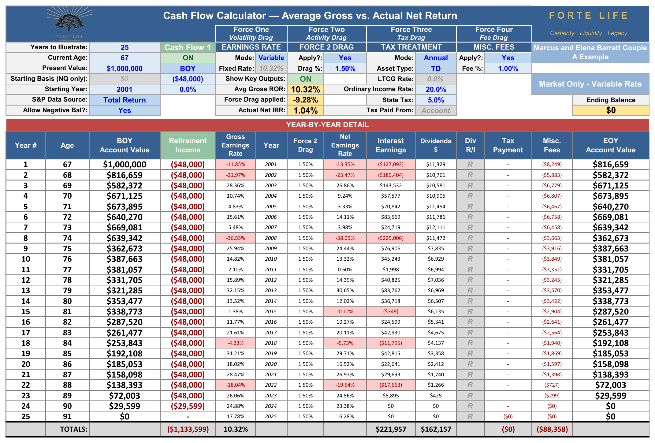
The actual Forte Life Cash Flow Calculator export, year by year, with all four forces applied — never retyped.
Two facts in that page carry the argument of this whitepaper in a single run. The average gross return across these twenty-five years was 10.32% — the very number the brochure advertises — and twenty of the twenty-five years finished positive — yet the account still emptied, because the four forces worked on every dollar every year and, in distribution, the order of the early losses (2001, 2002, and the −38% of 2008) did damage no average can show. The Actual Net internal rate of return on the whole run was 1.04%. This is the accumulation gap of Sections 1 through 7, met at the worst possible moment — the subject the companion Distribution analysis takes up in full.
This appendix reproduces Cash Flow 1 of the Forte Life Cash Flow Calculator (Market Only — Variable Rate): $1,000,000 present value, current age 67, 25 years, S&P 500 total return beginning 2001, 10.32% average gross ROR, 1.50% activity drag, 20% ordinary income tax + 5% state, 1.00% fee. Every figure is reproducible from the market's own published returns.