The Two Retirements
Two people, the same money, two very different endings — and the difference isn’t how much they saved. It’s the gap between the number Wall Street shows you and the number you actually retire on.
Accumulation series · The Actual Net Return · Article — about a 15-minute read, one of four.
You Were Never Handed the Future
Underneath almost every retirement plan sits an assumption no one says aloud: that you can know, roughly, what will happen. You can't. You live forward, through uncertainty, the whole way — and the future is never a single path. It is a range, and it is uncertain in two directions at once: how much your money will earn, and when you will actually need it.
You already act on the first. It is why a sensible portfolio holds bonds — not because bonds out-earn stocks (typically they don't), but to narrow the range, trading some of the average for far more certainty about where any given year lands. The second, almost every plan ignores: a projection for a forty-two-year-old retiring at sixty-seven quietly assumes the money sits untouched for exactly twenty-five years. But life doesn't wait for a date. A job ends, an opportunity appears, a need arrives in some year no projection ever marked.
So the real goal was never to chase the highest rate. It is to keep your money useful across the whole range of futures that could arrive — growing, safe, and reachable in whatever year it is actually needed. Every dollar you own is making that trade right now: Growth, Safety, Access — pick two, give up the third. A savings account gives up Growth; the market gives up Safety; a retirement account or a house gives up Access. The question this whole analysis is built to answer is whether a single dollar can be made to hold all three at once.
Rate is one input to that goal. It was never the goal itself. But it is where the gap begins — so we start there.
The Pitch You’ve Heard Your Whole Life
“Invest in the market. Over the long run, the S&P 500 returns ten to twelve percent a year. Stay in. Be patient. Retire comfortably.”
It sounds reasonable. It is backed by real data. And it is, in one specific and costly way, misleading — not because the market doesn’t produce those returns, but because what the market produces and what you keep are two entirely different numbers.
Here are the two numbers, from the same twenty-five years.
Across 2001 through 2025 — the quarter-century most of today’s savers have been investing through — the S&P 500 averaged 10.32% a year.
What a real investor actually kept of it, on a $100,000 account, was $332,750 after twenty-five years — an annual return of 4.93%.
Both of those returns — 10.32% and 4.93% — are true. Both come from the same market, the same years. One is the number on the brochure. The other is the number you retire on. Everything that follows is the story of the distance between them — and it can be reproduced, to the dollar, on any calculator.
Four Forces, Working Silently, Every Year
The projection your advisor showed you — the chart climbing left to right to $2 million — is almost always built on one number: a flat, average gross return. What it leaves out are four forces that work against you every year and appear on no projection. Together they are the Four Forces of Return Compression.
A loss costs more than the next gain returns. The market doesn’t hand you 10% a year. It hands you +26% one year and −37% the next — and a 37% loss followed by a 37% gain does not put you back where you started; it leaves you well behind. Averaging the ups and downs gives one number. Living through them gives a smaller one. This is Volatility Drag, and across the full century it quietly cost 1.83 percentage points a year.
Funds quietly trail the index — even if you never mistime a thing. Most retirement money doesn’t sit in a bare index fund; it sits in actively managed funds, the default in most 401(k)s. Roughly nine in ten of them lose to the index they’re measured against. That isn’t your fault — it’s the record of the professional management you were placed in. And separately, the ordinary human timing of adding and withdrawing money at imperfect moments trims a little more. Together they are Activity Drag — the cost of a dollar being actively managed rather than left to track the index — and neither one requires you to have done a single thing wrong.
A taxed dollar is one that never compounds again. In a traditional 401(k) or IRA, every dollar you withdraw is taxed as ordinary income — not just the growth, the entire balance, contributions included. At a 25% rate, a quarter of the number on your statement was never yours to spend. This is Tax Drag.
A percentage charged every year, on your whole balance — not just your gains. Fee Drag is the smallest of the four, and the only one you actually choose. You can’t vote out a bear market or repeal the tax code. You can decide what you pay. And most people have never seen what they truly pay, because fees come in layers — the small one on the brochure, and the larger ones no statement is built to show. On a single $100,000 account over a working life, that full one-percent load — what you actually pay, measured against paying nothing — works out to about $135,000 of your own money — gone, quietly, a slice at a time.
What the Math Actually Shows
Watch the century’s own average — the most generous, crash-free number the record allows — fall through those four forces:
Wall Street projects the arithmetic average of 2001–2025, 10.32%, which on $100,000 compounds to $1,164,870. But the market never delivered a smooth 10.32% — it delivered the actual jagged sequence, which compounds to $812,153. Activity Drag takes it lower. The fee takes it lower. And the 25% tax at the end leaves $332,750.
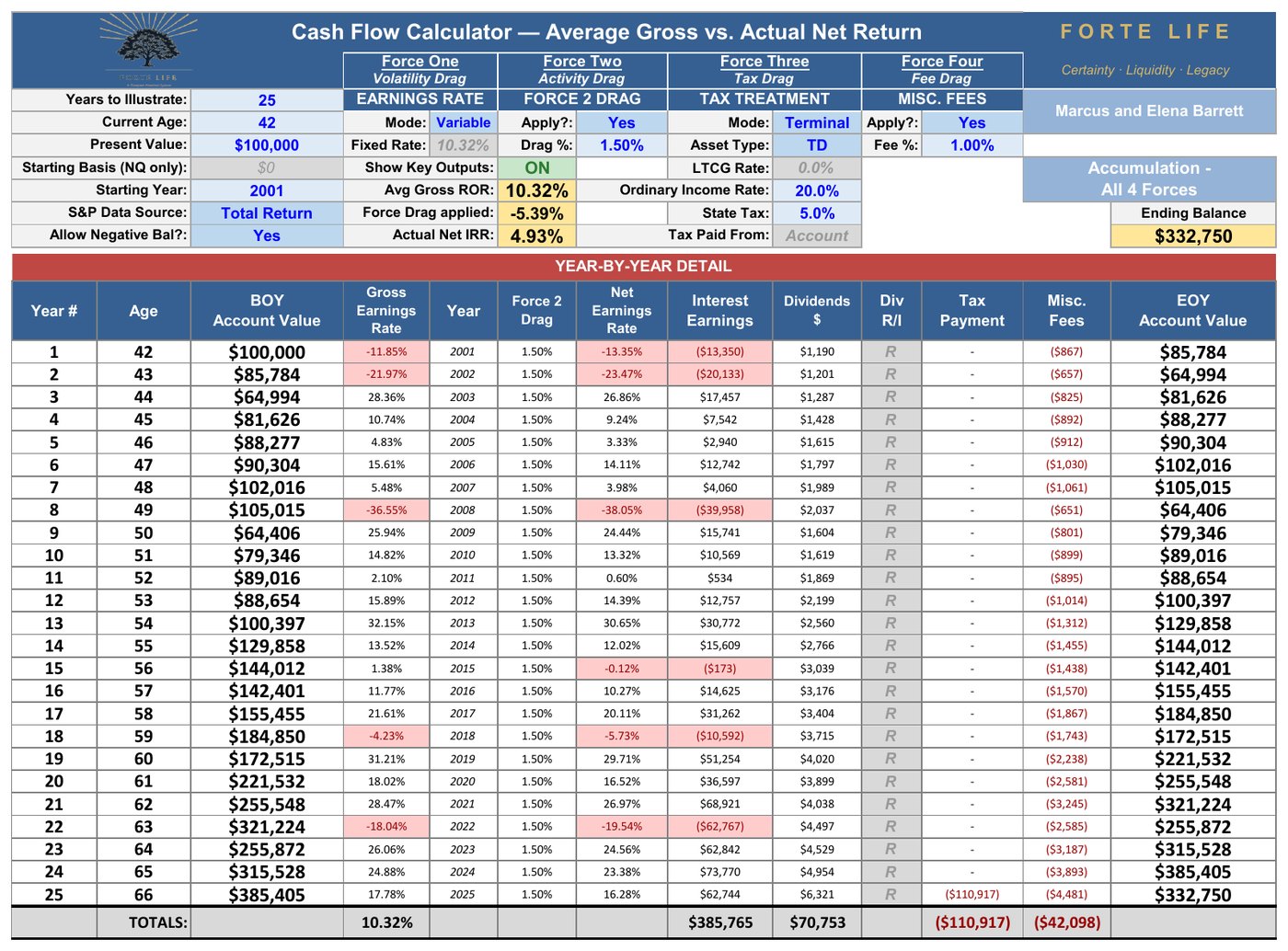
10.32% advertised. 4.93% kept.
And here is the part that should stop you: this was not a bad stretch. Twenty of those twenty-five years finished positive, and the winners averaged more than 17% apiece. Only five years were down. The compression isn’t caused by the crashes. It’s caused by four forces working on every year — the good ones included.
Nor was 2001–2025 a cherry-picked window. Run the same math on all seventy-six twenty-five-year windows in the last century, and the compression appears in every single one — seventy-six out of seventy-six. The typical window turned the market’s advertised average into a kept return of 6.4%. Not one escaped.
The Half of the Story No One Tells You
Everything to this point measured one thing: the rate at which money grows. It’s a fair comparison. It’s also only half the story — and the smaller half.
Because money isn’t saved to be a number. It’s saved to become income, and what’s left becomes legacy. A growth rate is a measurement taken in the middle of a story — and most people don’t look hard at how it ends until they’re living in the ending, when there is far less that can still be done about it, and far less time for it to work.
So look at the ending. Two retirees, both sixty-seven. One has $1,000,000 in a 401(k). The other has $593,235 of cash value in a properly structured whole life policy. It looks like a rout — the 401(k) holder has nearly twice the money.
But a 401(k) is money the retiree hasn’t paid tax on yet, and the bill comes due on every dollar as it comes out. The policy’s cash value is already tax-free — it’s spendable as it sits. So the real comparison isn’t a million against $593,235. It’s what each one actually puts in your pocket.
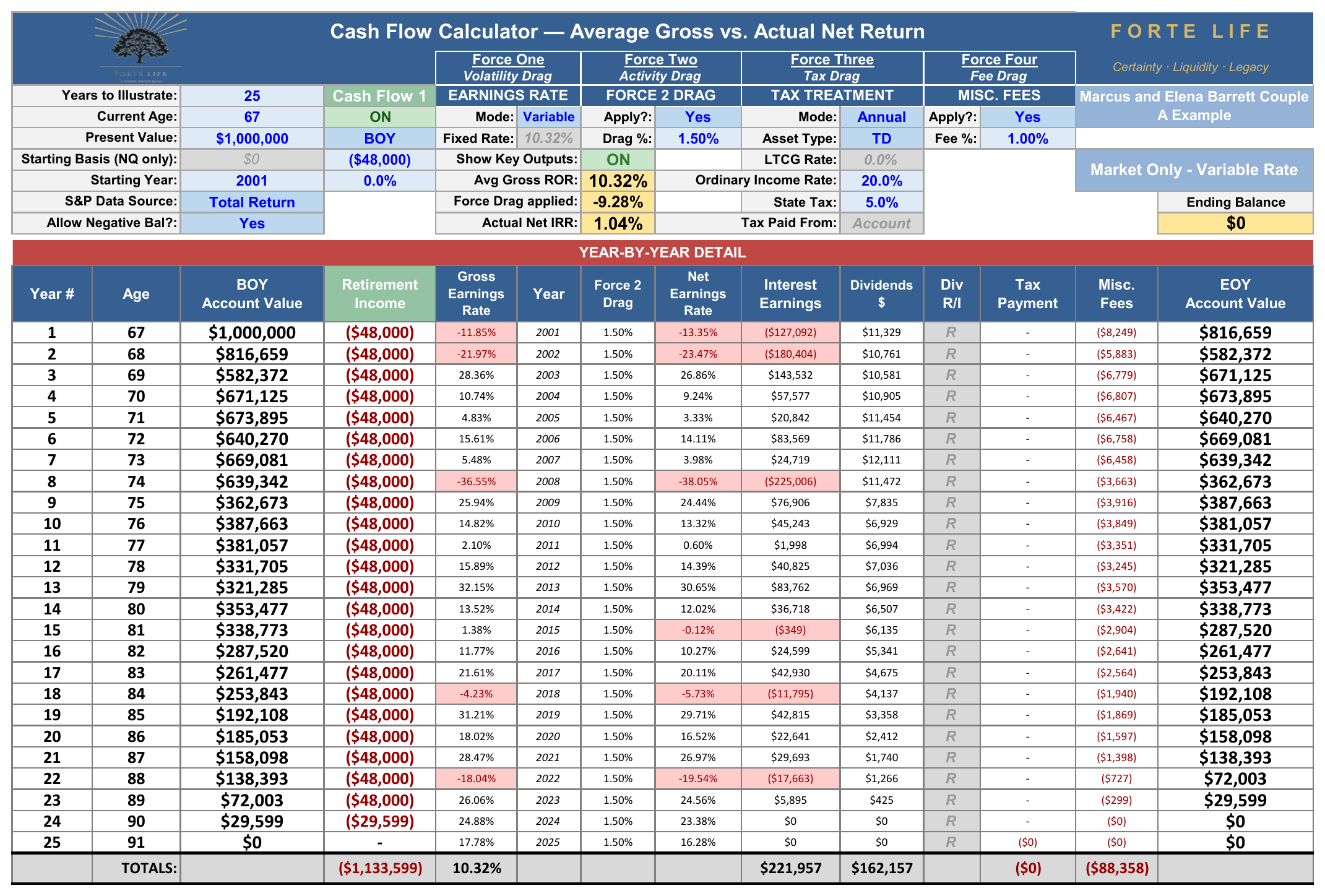
Watch. The 401(k) holder draws $48,000 a year — a sensible 4.8%. It sounds like plenty, until the tax takes its quarter and $36,000 is what actually reaches the checking account. Run that draw through the real 2001–2025 market — and after the four forces have taken their cut, year after year — the account runs dry in the twenty-fourth year. At ninety, it’s gone. The last years arrive with nothing behind them, and nothing is left for anyone.
The policyholder — starting with what looked like far less — draws $38,000 a year, tax-free. Not $38,000 minus tax. $38,000 in the pocket — more than the “millionaire” nets. It arrives every year for the full twenty-five. It never runs dry. And at ninety-two, after paying out nearly a million dollars, it still leaves $165,676 behind.
Read that again, because it is the whole article in one place: the retiree with less money drew more spendable income, for more years, and still left a legacy — while the one who looked twice as rich ran out at ninety.
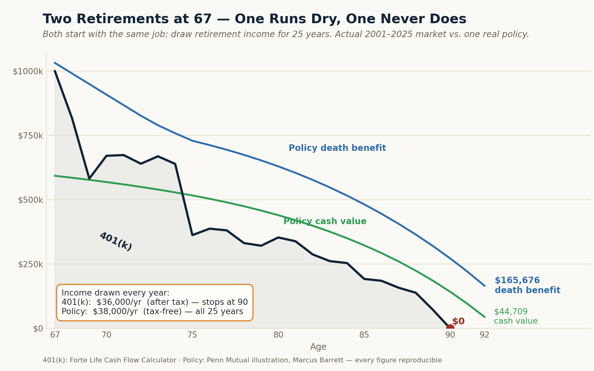
You don't have to take my word for "runs dry at ninety." The navy line is the 401(k) — it hits zero. The policy's cash value (green) and death benefit (blue) never do, and it pays more, tax-free, the whole way.
These aren’t hypotheticals, and I did not build them to win an argument. The $38,000, the tax-free income for twenty-five years, the $165,676 left at ninety-two — every figure comes straight off an actual insurance-company illustration for a real policy design. The 401(k)’s twenty-four-year slide to empty comes from running a $1,000,000 account through the actual year-by-year returns of 2001 through 2025. Both are numbers you could reproduce.
And it is worth pausing on what that policy actually is, because the name carries more baggage than the design deserves. If you have ever heard whole life criticized — and most people have — the criticism was aimed at the ordinary design: a policy built to maximize commission and death benefit, sold to someone who was never shown the arithmetic. What is described here is the opposite of that.
By “properly structured” I mean a specific design — a small base policy with a large paid-up-additions rider, funded to just under the tax line — which is not how most whole life is built, and not something to assume your current insurance agent will get right without asking.
There is a reason the right design is rare, and it does not flatter my own profession: the design that serves the client best pays the advisor the least. In a recent case, the properly structured version paid the agent about 18.8% of what a conventionally built policy would have paid on the identical premium — roughly eighty percent less. That is precisely why badly built policies are the norm, and why the first question to ask about any policy is not what it costs, but how it is designed.
How can the smaller pile do more? Because the two aren’t doing the same work. The market keeps only what survives volatility, activity, fees, and a quarter lost to tax — and what’s left has to stretch. The policy keeps what it credits, pays it out tax-free, and doesn’t deplete. The market has to earn a great deal more, because it keeps a great deal less.
And the tax-free part does something quieter, too. Because that income doesn’t count as income at all, it doesn’t add to the figure that decides how much of your Social Security gets taxed, or whether you cross into the IRMAA surcharges — the extra amounts Medicare charges higher-income retirees, that most people have never heard of until the bill arrives. Not merely tax-free: many assets people call tax-free, like municipal bonds, still count toward that figure. Properly structured policy income stays out of it entirely — which quietly protects everything else in your plan.
“But Doesn’t the Market Win on Rate?”
You may be thinking the market still comes out ahead on the raw return. But be careful what that comparison is actually holding up against each other — because the number people reach for is the market’s advertised return, and that number, as the last few pages showed, is not what anyone keeps. The honest comparison is not to the brochure’s 10%. It is to what the market actually left after the four forces: a typical twenty-five-year net of about 6.4%, and 4.93% in the window we just traced.
The policy’s number — an illustrated 5.00% Actual Net Return — assumes today’s dividend scale of about 6.00%, a scale that sits below 74% of the insurer’s own thirty-eight-year history, and the illustration is required by law to assume it never rises again for the rest of your life. It is quoted, in other words, near the low end of what that instrument has historically done. The market’s number is quoted at its average.
So the honest comparison sets the market’s actual net — quoted at its average — against a policy quoted near its floor, tax-free, with a contractual guarantee beneath it. That is a far closer contest than the brochure suggests. And even that contest is the wrong one, because a retiree can win on rate and still run out of money at ninety. Rate was never the test. What the money does — how much income it delivers, for how long, and what it leaves behind — is the test. And that is the contest the coordinated plan wins.
The Safe Money You Already Hold
The two retirements above were about the whole nest egg. There is a smaller, quieter version of the same mistake sitting in almost every portfolio right now — in the safe money.
You may not think of yourself as a bond owner. But if you hold a target-date fund, a “60/40” account for example, or you simply followed standard advice, a real slice of your portfolio is already in bonds and cash, on purpose. Nearly every sound plan calls for two kinds of safe money: cash — at least a three-to-six-month emergency fund, and a larger share of the portfolio as you age — and a bond allocation that grows the same way. The common rules of thumb — keep “110 minus your age,” or “120 minus your age,” in stocks — put the rest in the safe sleeve, which for someone in their forties runs a fifth to a third of everything. This is good advice. You should have a safe sleeve, and your equities keep doing the one job only they can do — none of this touches them.
Put numbers on it. A 42-year-old with $400,000 in total capital, following that accepted advice:
| Position | Share | Amount | Its job |
|---|---|---|---|
| Equities | 75% | $300,000 | Long-run growth |
| Bonds | 18% | $72,000 | Safety and income |
| Cash | 7% | $28,000 | Reachable reserve |
| Safe sleeve (bonds + cash) | 25% | $100,000 | Safe and reachable |
A full quarter of everything — $100,000 — is there to grow safely: to stay protected and reachable, not to chase the market. This is the range-narrowing from the start of this article made concrete — the money you keep reliable and within reach, so it is there in whatever year you actually need it. It is the reserve the companion Living Asset Strategy calls your Opportunity Fund — and there it becomes a dollar you can put to work without ever emptying it. This is about that quarter — the safe sleeve — and whether it is actually keeping what it should.
What It Actually Replaces
So measure it. Here is what that safe sleeve actually keeps over twenty-five years — spelled out, nothing hidden inside a blended average:
| The safe sleeve, spelled out | Bonds · $72,000 | Cash · $28,000 |
|---|---|---|
| Gross rate | 5.4% | 3.0% |
| Less fund fee | −0.36% | — |
| Less income tax, every year | −25% of the gain | −25% of the gain |
| Net rate it actually keeps | 3.78% | 2.25% |
| After 25 years | $182,043 | $48,836 |
The bonds earn a fair 5.4% — but a fund fee comes out, and income tax comes out every single year they work, leaving 3.78%. The cash earns about 3% over the long run, taxed the same way, leaving 2.25%. Together the sleeve grows to $230,879 — a blended 3.40% a year. (Money-market and high-yield savings pay closer to 4% today, but no one earns that for twenty-five straight years; 3% is the honest long-run figure.)
Now hold that same $100,000 in the cash value of a properly structured policy instead — same safety, still reachable on demand, charged no fund fee and no annual tax:
| $100,000 safe sleeve · 25 years | Net rate | After 25 years |
|---|---|---|
| Bonds + cash, as typically held | 3.40% | $230,879 |
| Policy cash value | 5.00%, Tax-Free | $338,635 |
Same safety. Same access. $107,756 more — and it replaces both the bonds and the cash, not just one sleeve of it.
Read it net to net, because that is where the “but whole life earns less” reflex breaks. The bond’s 5.4% is a headline rate — before its fee and the tax it owes every year — and what it actually keeps is 3.78%; the policy’s 5.00% is already net, and tax-free. Even with the entire safe sleeve in bonds and no idle cash at all, the most it keeps is $252,838 — still $85,798 short of the policy’s $338,635 — because the bond is charged a fee and taxed every year while it works, and the cash value is not.
One detail makes it click. The dividend that funds that policy’s cash value is itself produced largely by high-grade bonds — the general account of a large mutual insurer is dominated by exactly the asset class you are already holding for safety, run at a scale and quality an individual cannot replicate. This is not an exotic alternative to your safe money. It is the same kind of asset, in a place that isn’t taxed every year and isn’t locked for a term.
Return to the three-way trade from the start of this article — Growth, Safety, Access, pick two. The cash value of a properly structured policy is the rare place a dollar holds all three at once: it grows, it stays safe behind a contractual floor, and it stays reachable on demand. And it can be reached without interrupting its own compounding — the same dollar doing two jobs at once, which is the subject the companion Living Asset Strategy analysis takes up in full.
So the point here is only this: the safe money in most plans is not underperforming because it was invested badly. It is underperforming because of where it is located.
There Is a Better Way to Build This
The answer is not to abandon the market. Market growth is essential. The answer is to stop asking one instrument to do every job, and to build a plan around three coordinated elements instead of one:
Market-based growth, for the long-run engine it genuinely is. Guaranteed lifetime income, so that some floor beneath you does not move when the market does. And non-correlated buffer capital — a source that doesn’t fall when the market falls, so a bad year early in retirement is survived rather than suffered, and whose income the tax code doesn’t count against you, so drawing on it doesn’t quietly raise the tax on your Social Security or your Medicare premiums. Non-correlated to the market’s swings, and non-correlated to your tax bill.
That third element is the one almost no plan has, and it is the one that matters most at the exact moment the saving years end. It doesn’t take much: across a century of history, the longest unbroken run of down years was four, and three to five years of buffer covers all of it. It is a small, achievable amount of capital standing between an ordinary down market and a forced sale that can permanently reprice a retirement.
Market investing solves problems insurance cannot. Insurance solves problems the market cannot. The plan that coordinates both produces an outcome neither can produce alone.
The Coordination Problem
By your fifties or sixties you have usually built a small constellation of professionals — an advisor who manages investments, a CPA who handles this year’s taxes, perhaps an attorney who structured a trust years ago. Each is good at their part. But a coordinated plan outperforms a lifetime of good decisions made separately — and almost no one is standing at the level above, coordinating how those decisions interact across the next thirty years.
The result is a plan that looks excellent in pieces and does not function as a whole. My role as a Retirement Income Specialist is not to replace the people you trust — it is to be the architect who coordinates their work across both halves of retirement: the building, and the far harder problem of turning what you built into income that lasts.
What This Means for Your Life
Strip away the mathematics and here is what it comes to.
It means the projection you were shown in your forties was built on a number no investor has ever actually received — and that the honest number, the one after all four forces, is one almost no one is ever shown.
It means the plan most people carry into retirement is one part of a three-part structure, missing the two parts that do their most important work at the worst possible moment.
And it means the difference between the two retirements at the start of this article — the one spent watching the market, and the one spent living — is not mainly a difference of how much. It is a difference of how it was built.
That is a solvable problem. But it is only solvable before the fact — while there is still time to position the pieces. The worst time to discover your plan has one leg instead of three is the year you need all three.
What Comes Next
The numbers in this article are general. Yours are not.
The clearest place to start is a Capital Coordination Session — a focused look at how your money is actually put together: whether your accumulation, your income, your taxes, and your legacy are working as one system, or just sitting side by side. You get something of value whether or not you buy anything — you leave knowing where the seams are. What it produces is a coordinated Retirement Income Plan — principles first, then strategy, then whatever instruments the plan actually calls for, with one person designing for the total.
Every figure in this article belongs to an illustration. The ones that matter belong to you.