The Actual Net Return
An Executive Brief on What the Market Really Delivers — and What a Complete Plan Requires
For Anyone Building Wealth Today or Approaching Retirement
A condensed analysis drawn from one hundred years of historical market data (1926–2025)
Accumulation series · The Actual Net Return · the Executive Brief — about a 20-minute read, one of four.
Built from “The Actual Net Return: A Rigorous Analysis,” the companion whitepaper. Every figure in this brief is a direct output of the Forte Life Cash Flow Calculator run on that data, or a statistic measured directly from it.
Two Numbers
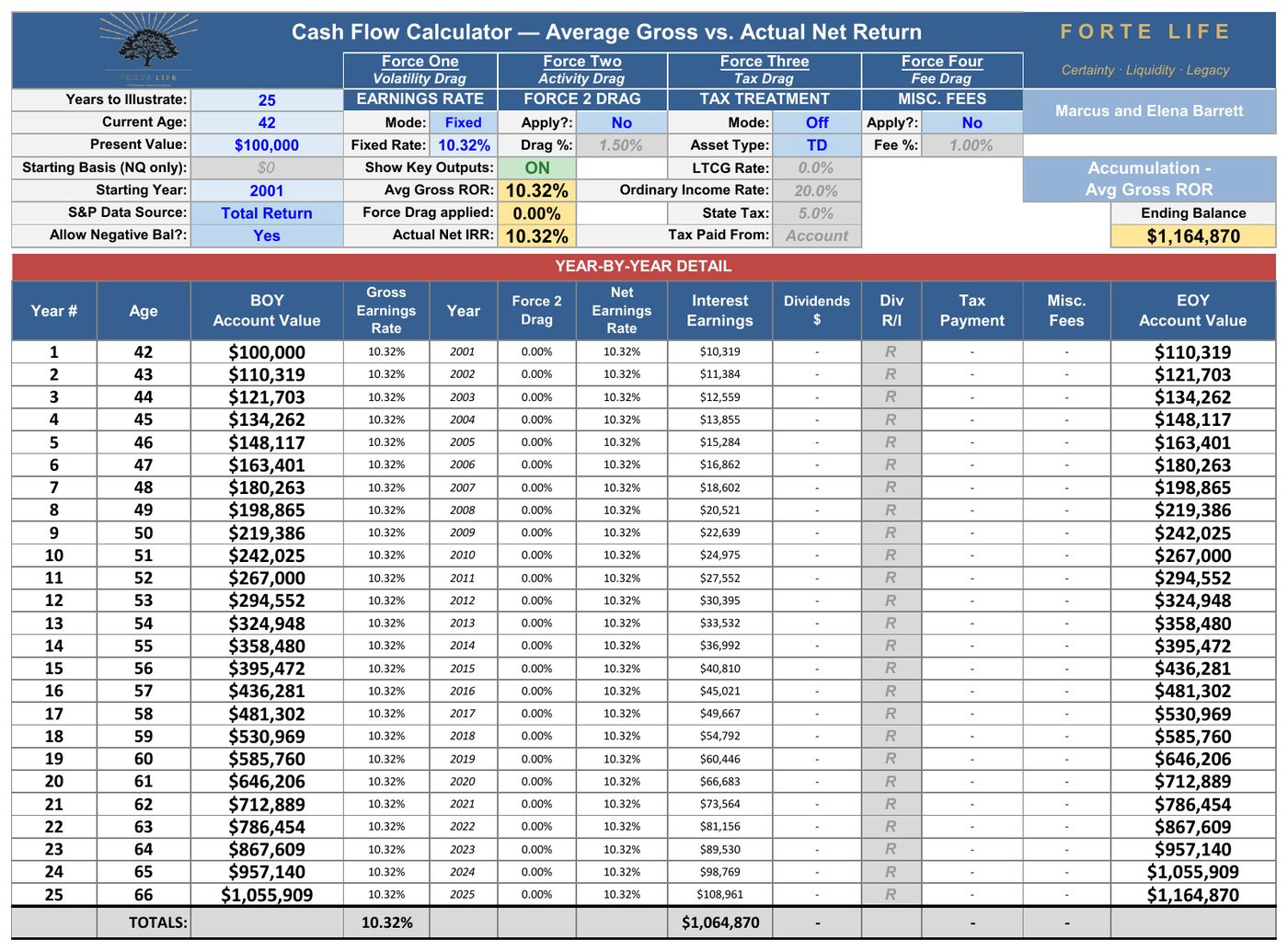
10.32% is what the S&P 500 averaged across the last twenty-five years — 2001 through 2025 — the quarter-century most of today’s savers have been investing through.
4.93% is what a real investor kept of it: on a $100,000 account, $332,750 after twenty-five years, once all four forces had taken their turn.
Both numbers are true, both come from the same twenty-five years, and every step between them is computed to the dollar in the pages that follow — reproducible on any calculator from the market’s own published returns.
The first number is what retirement plans are built on. The second is what retirements are actually lived on.
A Note to the Reader
This brief presents the core findings of a longer analytical whitepaper on the same subject. It is designed to be read in ten to fifteen minutes. The full whitepaper documents the underlying mathematics, the hundred-year rolling-window analysis, the historical data sources, and a detailed examination of the objections a skeptical reader will raise. Readers who want the complete methodology should request it.
The author is a Retirement Income Specialist whose practice spans the full financial lifecycle — wealth building during the accumulation years, and the design and implementation of coordinated retirement income strategies in the distribution phase. He has been in this role for nearly twenty years and currently serves more than 500 clients across the full age and financial spectrum, residing in every state in the United States.
The standpoint here is that of an analyst evaluating both market-based and insurance-based instruments on identical terms. When specific recommendations are appropriate for a given client, they are selected from a broad range of carrier appointments to match the right structure and the right company to that client’s situation — not to push any single product across all clients.
A note on age. The framework in this brief is relevant for any adult who has begun building income and can establish a consistent savings habit — whether the reader is in their twenties just starting out, in their forties balancing competing priorities, or in their fifties and sixties evaluating what to do next.
Younger readers benefit from the time value of money — the single most powerful variable in any compound-growth calculation. The same framework applied to a thirty-year-old produces meaningfully larger outcomes from the same monthly contributions than the forty-two-year-old example used here, because compound time multiplies every dollar saved. Starting early is not a small advantage. It is the entire ballgame.
Older readers who suspect they may be “too old” for properly structured whole life to make sense may find the analysis surprising. At older ages, the cost of insurance does rise, but the IRS Modified Endowment Contract corridor simultaneously requires less death benefit per premium dollar to preserve tax-free distribution treatment. These two forces largely offset each other. Even with only five to ten years of accumulation remaining, properly structured whole life still does what no market asset can — particularly because the volatility buffer it creates becomes more valuable, not less, as a client approaches the phase where sequence-of-returns risk dominates. The right question is not “how old am I?” but “what does my complete plan currently include, and what is missing?”
The Problem
The retirement planning world has long been divided into two camps. One builds plans around market investments and trusts that long-term returns will deliver. The other builds plans around insurance-based guarantees and trusts that contractual certainty matters more than market upside. Each camp views the other with skepticism. Each is wrong about the other — and wrong about what a complete retirement plan actually requires.
The better framework does not require choosing between them. It requires coordinating them. Market investing solves problems insurance cannot solve. Insurance solves problems markets cannot solve. The plan that coordinates both produces outcomes neither approach can produce alone.
This brief makes that case — beginning with a sober look at what the market actually delivers, and ending with what belongs alongside it.
The Gap Between What Wall Street Says and What You Actually Net
Four forces stand between the return the market advertises and the return an investor keeps. They are not opinions. Each is measured, each is documented, and each is unavoidable. Together they are the Four Forces of Return Compression.
Volatility Drag
The S&P 500’s arithmetic mean annual total return across its last full century — 1926 through 2025 — is 12.11%. The rate at which money actually compounded across that century is 10.28%. The difference, 1.83 percentage points a year, is Volatility Drag.
It is not an assumption, and not a deduction applied to a projection. It is simply the difference between averaging a series of annual returns and multiplying them together. Gain 50% one year and lose 50% the next and your average return is zero — but your account is down 25%. Losses cut deeper than equivalent gains repair.
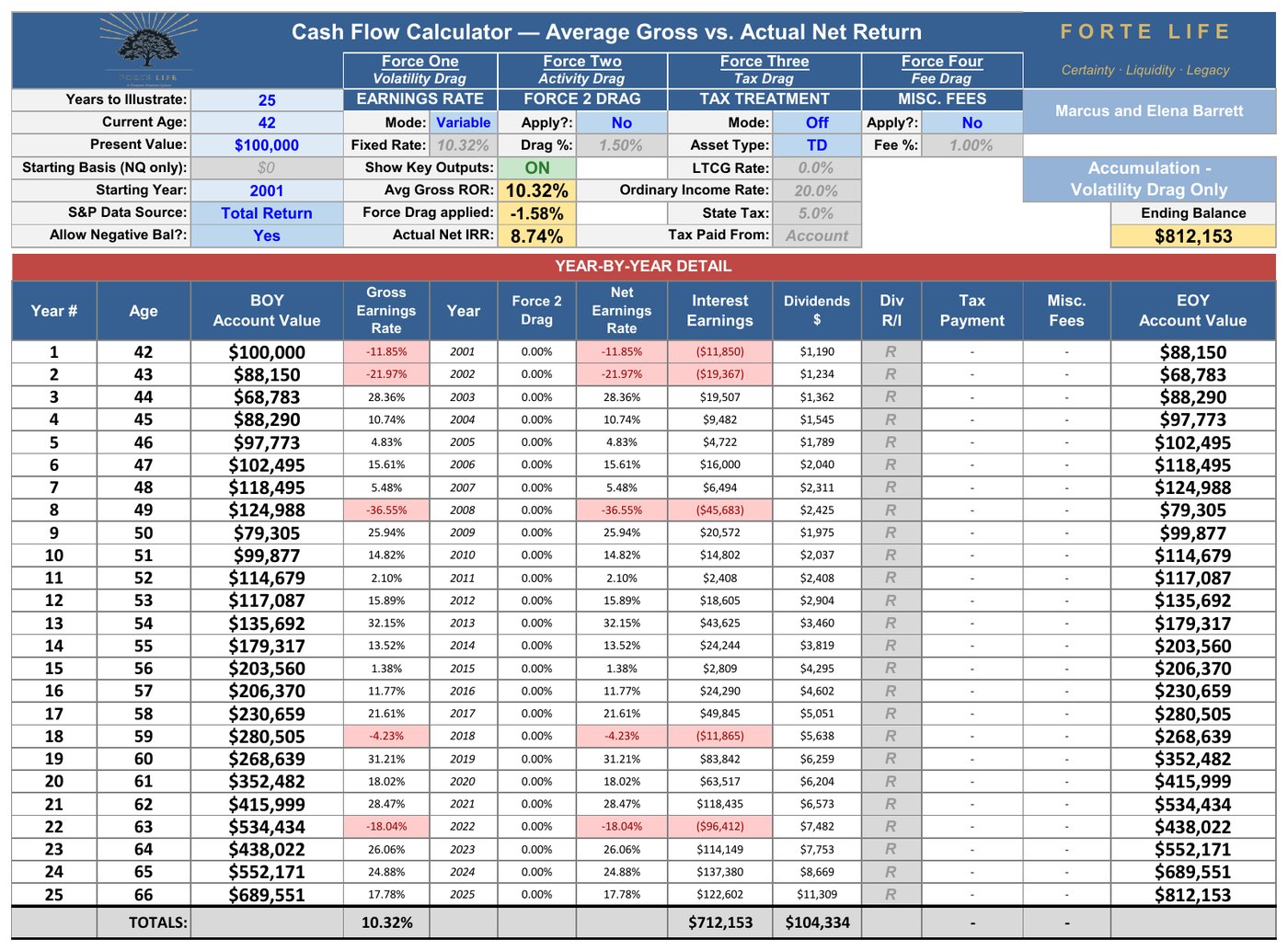
Applied to the quarter-century just completed: the arithmetic mean of the twenty-five annual returns from 2001 through 2025 is 10.32%, which on $100,000 projects to $1,164,870. What the actual year-by-year sequence compounded to was $812,153. The $352,718 that separates them is Volatility Drag, and anyone with the published return series and a calculator arrives at both numbers. One caution on that 1.83: the drag is not a fixed constant but whatever the actual sequence produced — across this 2001–2025 window the arithmetic 10.32% compounds at 8.74%, a narrower gap of 1.58 points, because these twenty-five years were less volatile than the full century.
Activity Drag — The Cost of an Active Dollar
Most investors do not capture the index’s return, and not through any lack of discipline. Two separately measured effects stand in the way.
The first is manager underperformance. Most retirement money does not sit in a bare index fund; it sits in actively managed funds — the default option in most 401(k)s, the funds most advisors allocate to. Roughly nine in ten trail the index they are measured against over twenty-year horizons — before the investor makes a single decision (S&P Dow Jones Indices, SPIVA). And this is the ordinary way to invest, not a fringe one: as of the end of 2025, roughly 46% of U.S. fund assets — about $16 trillion — sat in active funds rather than index funds. This is not a failing on the investor’s part. It is the documented record of the professional management they were placed in.
The second is the behavior gap. Even setting fund choice aside, the return investors capture falls short of the return their own funds report, because real people add and withdraw money at imperfect moments — not recklessly, just humanly. Morningstar’s Mind the Gap measures this at roughly 1.2% a year over multi-decade periods — the smaller and more contested of the two legs.
Together these two effects make up Activity Drag — the cost of a dollar being actively managed and humanly handled rather than left to track the index. This analysis applies 1.5% per year, resting on the structural leg alone — conservative before the behavior gap is counted. Everywhere in this brief I have given the market every reasonable benefit of the doubt, and I am doing the same here: it is a deliberately conservative figure, and one that neither component requires the investor to have done anything wrong to earn.
Tax Drag
Most American retirement wealth sits in tax-deferred accounts — the traditional 401(k) or IRA. Every dollar in such an account, contributions included, comes out as ordinary income.
On the 2001–2025 sequence, with volatility and a realistic fee already applied, a $100,000 tax-deferred account reaches a pre-tax balance of $631,710. At a combined 25% rate — roughly 20% federal and 5% state — the terminal tax is $157,928. The investor keeps $473,782.
Read that middle figure the way the IRS will. The 25% applies to the entire ending balance — not the gains, the balance. Nearly $158,000 of the ending value was never the investor’s to keep. A projection that shows the pre-tax balance is showing a number that does not exist.
Fee Drag
Of the four forces, fee drag is the smallest — roughly 1.06 percentage points of annual return, just under the tax drag and well below volatility and activity drag. A 1.0% fee charged annually on a growing balance compounds into slightly more than 1.0 point of annualized return, because every dollar it removes can no longer compound in any later year — which is why it is 1.06 and not exactly 1.00. That is exactly why it gets waved away. It is also exactly why waving it away is a mistake, because fee drag is the only one of the four you actually choose. You cannot vote a bear market out of existence. You cannot repeal the tax code. You can decide what you pay to invest.
And “smallest” hides something, because most people have never seen the true size of their fee. Fees come in layers.
At the surface is the fund’s own expense ratio — three to seven basis points for a broad-market index fund. Call it 0.05%. Run through the actual 2001–2025 market on a $100,000 tax-deferred account, that visible fee costs about $7,568 in final after-tax wealth. A rounding error.
Beneath it sits the advisory fee, usually quoted near 1%, and usually the last number a client is ever shown. Beneath that sit the layers almost no one is shown at all: trading costs inside the funds, revenue-sharing and platform fees, the drag from uninvested cash. Each looks too small to matter. Stacked, they are the difference between the fee on the statement and the fee in reality. For a typical advised pre-retiree, once every layer is counted, the all-in cost lands at or above 1.0% a year. A comprehensive managed arrangement runs higher still — often 1.5% or more.
$100,000 · actual 2001–2025 market · 25-year hold · tax-deferred, 25% terminal tax · Activity Drag set aside, so the fee force can be seen alone
| Which investor you are | All-in annual cost | After-tax ending | Lost vs. paying nothing |
|---|---|---|---|
| No fee at all — the reference ceiling | 0% | $609,114 | — |
| Do-it-yourselfer — pays only the fund’s own expense ratio | 0.05% | $601,546 | −$7,568 |
| Typical advised investor — every cost combined, seen and unseen | \~1% | $473,782 | −$135,332 |
| Comprehensive managed account — every cost combined | 1.5%+ | $417,450 | −$191,664 |
Each row is a different investor, and each percentage is that investor’s complete all-in cost — not a fee added on top of the row above.
That full one-percent load, measured against paying nothing at all, is not a fraction of a point on a brochure. It is $135,332 of your own money, gone, on a single $100,000 account over one working life. Withdrawn quietly, a slice at a time, from the very dollars that were supposed to become your retirement — and most people never see the number, because no statement is built to show it.
Why the dollar cost dwarfs the percentage. Across those twenty-five years, that one-percent fee added up to only about $54,000 in dollars actually paid. Yet the typical advised investor didn’t end up $54,000 poorer — they ended up $135,332 poorer after tax, the figure in the table above. The cost dwarfs the fee because every fee dollar is a dollar that stopped compounding the moment it left the account: you lose the fee, and then you lose all the growth that fee would have thrown off for the rest of your life. That second part has a name — Lost Opportunity Cost — and it’s why a “one percent” fee is never really one percent.
None of this says advice isn’t worth paying for. A good advisor earns their fee many times over. But you cannot judge whether a cost is worth it if you have never been shown what it actually is — and almost no one is shown.
What the Math Actually Shows
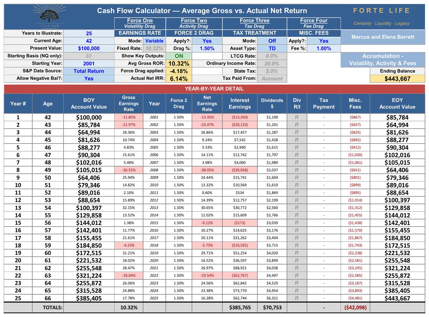
Here is the complete cascade, run on the twenty-five years most of today’s savers invested through. Every figure is reproducible from the market’s own published returns.
| Stage | Rate | $100K over 25 years |
|---|---|---|
| Average Gross — the arithmetic mean Wall Street projects | 10.32% | $1,164,870 |
| After Volatility Drag — the actual sequence compounds to less | 8.74% | $812,153 |
| After Activity Drag | 7.21% | $570,397 |
| After 1% Fee (pre-tax) | — | $443,667 |
| After 25% Terminal Tax — THE ACTUAL NET | 4.93% | $332,750 |
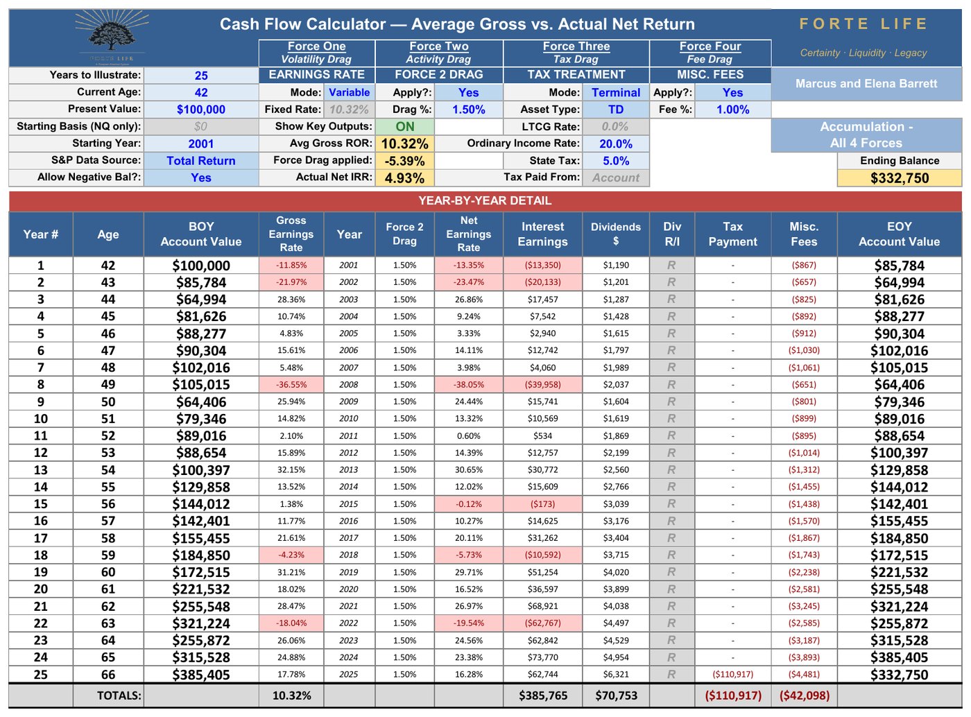
Ten-point-three-two advertised. Four-point-nine-three kept.
And this was not a punishing quarter-century. Twenty of those twenty-five years finished positive, and those twenty winners averaged 17.5% apiece. Only five years finished down. The compression is not caused by the bad years. It is caused by four forces working on every year, the good ones included.
Every Window in History
A fair skeptic should object that a single window can be cherry-picked. So take every twenty-five-year window the century contains — all seventy-six of them, starting 1926, 1927, and every year through 2001 — and run each through the same engine, with the same realistic investor. Not a simulation. Seventy-six actual quarter-centuries of American market history.
| Across all 76 windows | Actual Net IRR | $100K becomes |
|---|---|---|
| Worst window (1929–1953) | 1.46% | $143,751 |
| 10th percentile | 4.00% | — |
| 25th percentile | 5.45% | — |
| Median window | 6.40% | $472,014 |
| 75th percentile | 8.77% | — |
| Best window (1975–1999) | 13.13% | $2,185,661 |
Two things deserve a long look. The first is the width of the honest range: the same behavior, the same fee, the same tax treatment — and history handed one investor 1.46% and another 13.13%, purely by birth year. Anyone who quotes you a single expected return has skipped this table.
The second is the answer to the skeptic. In how many of the seventy-six windows did the four forces compress the market’s advertised average into a materially smaller Actual Net Return? Seventy-six. The gap was never narrower than 4.7 percentage points, and it ran to a median of 5.4. Compression is not a defect of a bad period. It is a structural property of every period the market has ever produced.
Across those windows, the median Average Gross was 11.8%; the median Actual Net was 6.4%. On a $100,000 account held twenty-five years, that is the distance between $1,625,718 and $472,014. It is not a rounding error. It is the retirement.
One Change the Record Cannot Show
There is a limit to what even a hundred years of history can tell you, and it is worth stating plainly. The century measured above — and especially its last four decades — was accumulated into. The largest generation in American history spent forty years as a structural net buyer of equities, paychecks flowing into the market through the retirement-plan architecture built for exactly that purpose. That generation has now crossed into retirement, where income needs and required minimum distributions make it a structural net seller for decades to come, with no equally large cohort of buyers behind it.
This is not a forecast, and this brief makes none. It is one more reason the historical record should be read as a record — not a promise. And the consequences of that reversal fall most heavily not on those still building, but on those drawing income, where the order of returns becomes decisive. That is the subject of the companion Distribution analysis.
The Managed Account Reality
The figures above use a 1% all-in fee — the conservative end of what a typical advised investor pays once every layer is counted. Move to a comprehensive managed arrangement at 1.5% or more, and the same 2001–2025 window produces an Actual Net of 4.40%, ending at $293,187 rather than $332,750.
Because 1% sits at or below true all-in cost for most advised investors, this analysis understates rather than overstates the compression. Everywhere in this brief, the market has been given every reasonable benefit of the doubt.
Accumulation Is Only the Second Act
Everything to this point has compared a single property of two instruments: the rate at which money grows. That comparison has been run honestly, on a hundred years of data.
It is also, on its own, close to meaningless. Money saved is not an end in itself. It is saved in order to become income, and what remains at the end becomes legacy. A rate of accumulation is a measurement taken in the middle of a story whose ending nobody has looked at.
So look at the ending.
Two retirees, both sixty-seven. One holds $1,000,000 in a traditional 401(k). The other holds $593,235 of cash value in a properly structured whole life policy. How either arrived there is a separate question; set it aside entirely.
A word on “properly structured,” because it carries the whole comparison: it means a specific design — a minimized base policy with a maximized paid-up-additions rider, funded right up to but under the tax line (the MEC limit) — which is not how most whole life is built, because it is the design that pays the agent the least. It also has to be managed over time, not set and forgotten; the structure is the strategy, and a conventionally built policy will not do what this analysis describes.
Put them on the same footing first. A million-dollar tax-deferred balance is not a million dollars — at 25%, what the retiree actually owns is $750,000. The policy’s cash value is already tax-free. Net for net, the policyholder stands at sixty-seven holding 20.9% less money.
| At age 67 | 401(k) | Whole Life Policy |
|---|---|---|
| Balance | $1,000,000 | $593,235 |
| Net of tax — what is actually owned | $750,000 | $593,235 |
| Annual income drawn | $48,000 | $38,000 |
| Spendable, after tax | $36,000 | $38,000 |
| Payout rate on net balance | 4.80% | 6.41% |
| Full years of income delivered | 23 | 25 |
| Death benefit at age 92 | $0 | $165,676 |
The 401(k) draws $48,000 a year — a 4.8% withdrawal most planners would call prudent. Taxed as ordinary income, $36,000 reaches the retiree. Run against the actual 2001–2025 market, carrying the same Activity Drag and fee applied throughout this brief, that account delivers twenty-three years of income and is exhausted in year twenty-four, at age ninety. The last two years never arrive. Nothing passes to anyone.
The policy pays $38,000 a year, tax-free, for all twenty-five years — a 6.41% payout rate against 4.80%, nearly a third higher. Over the period it distributes $950,000. And at ninety-two, having paid out nearly a million dollars, it still holds cash value and $165,676 of death benefit.
Twenty percent less money. More spendable income. Twenty-five years of it instead of twenty-three. And a legacy the larger asset could not leave.
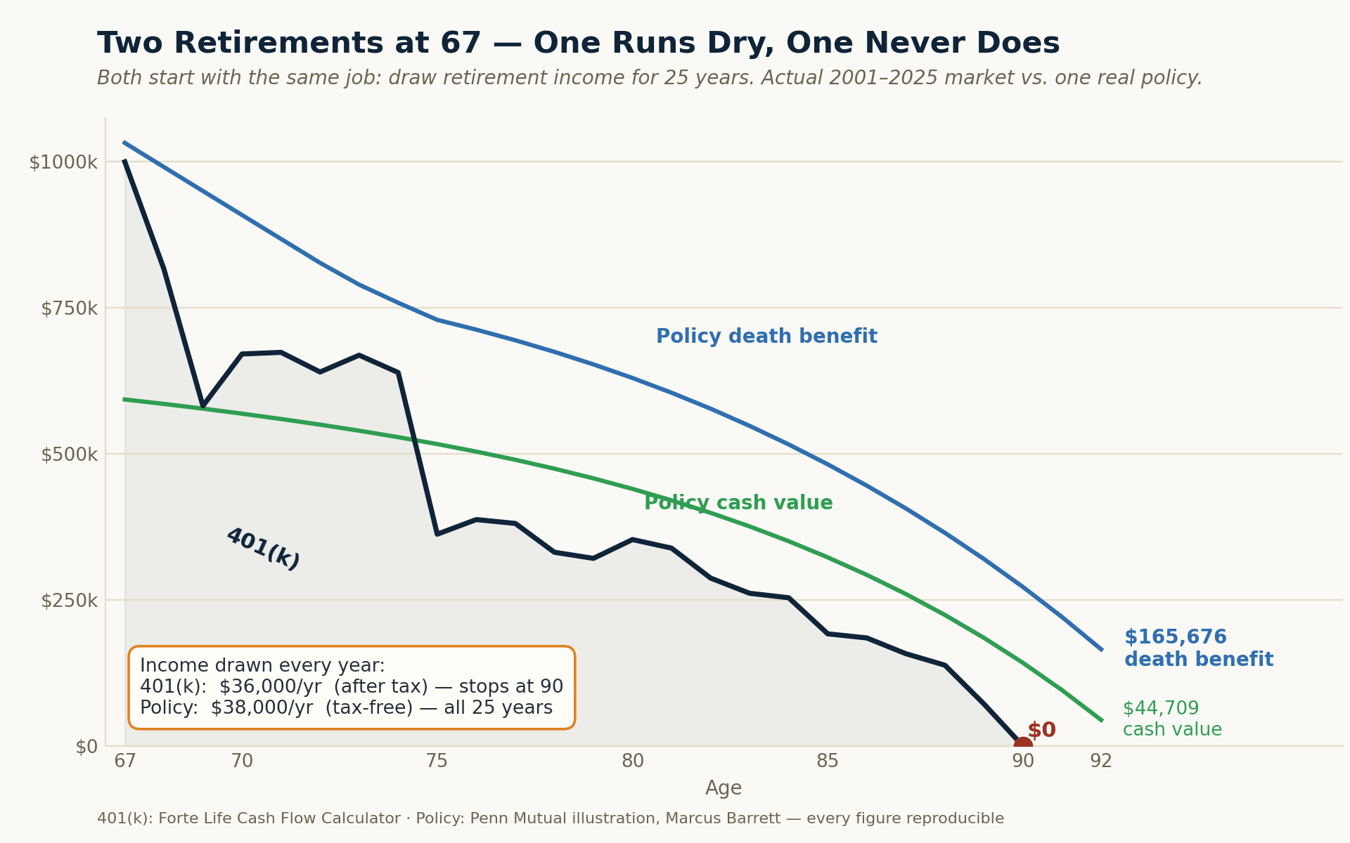
The navy line is the 401(k) — it hits zero at ninety. The policy's cash value (green) and death benefit (blue) never do, and it pays more, tax-free, the whole way.
Why? Because the two rates are not doing the same work. Of every dollar the market earns, a share is lost to volatility, a share to the funds and the timing, a share to fees, and a quarter of whatever survives to tax — and what finally reaches the retiree converts to income at 4.80%, taxable, with a real possibility of running out. Of every dollar the policy credits, all of it stays, and it converts to income at 6.41%, tax-free, without depleting, with a death benefit still standing behind it.
The market must earn a great deal more because it keeps a great deal less.
A retiree can win on rate and still run out of money at ninety. To judge two instruments on accumulation rate alone — the only chapter examined above — is to grade a three-act play on its second act.
The Apples-to-Apples Comparison
What must the market portfolio produce, before all four forces, to match what a properly structured whole life policy delivers contractually?
Solving the full four-force engine backward: an Average Gross of 10.61% at the realistic 1% all-in fee, or 11.16% in a comprehensive managed account. Both sit inside the 10–12% headline range Wall Street quotes — which is the point. Matching the policy requires the market to actually deliver its brochure, every year, for a working lifetime.
That requirement is not a formality history always cleared. Of the seventy-six quarter-centuries on record, seventeen delivered less than 10.61%, and twenty-seven — better than one in three — delivered less than 11.16%.
Now the honest part — and be precise about what the policy’s number actually is. Its illustrated 5.00% Actual Net Return assumes the carrier’s current dividend scale of 6.00% — and that scale sits below 74% of its own 38-year history, a scale the illustration is required to hold flat for life. It is far nearer a floor than a ceiling. Against the realized net distribution, that 5.00% sits between the 10th and 25th percentile of the seventy-six windows — quoted, in other words, at close to the lowest the carrier’s record would suggest, against the market at its average.
Be precise about what that figure is, because the two sides of this comparison are not the same kind of number. The 5.00% is what one contract projects at the carrier’s current dividend scale, held flat for sixty years — an illustration is required to assume today’s scale never changes. The market’s distribution is a century of realized outcomes across every rate environment there has been. One number is pinned to this year. The other roams a hundred.
Grant it anyway. Rate is not the argument, and rate is not the test. The policy’s number is contractual while every figure in that distribution was drawn, unknowably, at birth — and the investor who needs the market to clear 10.61% has no mechanism to choose which window they get. One instrument delivers a defined outcome; the other delivers a lottery over history, in which seventeen of the seventy-six cards would have failed to match the defined one.
“Buy Term and Invest the Difference”
The most common objection to everything above is also the most reasonable one: buy cheap term insurance for the protection, invest the savings in the market, and get both.
It is worth pricing honestly.
The policy in this analysis carries a death benefit that begins at $251,264 and grows past $1,032,395 by age sixty-seven. A 20-year level term policy bought at forty-two covers policy years one through twenty — age forty-two to sixty-two. Across exactly that window, the policy’s net death benefit averages $546,000, rising from $276,815 in the first year to $842,690 in the twentieth. At forty-two, in the best health class, $546,000 of 20-year level term costs $452 a year — $9,040 across the full term.
That cost is real, and it belongs in the comparison. Carried against the market portfolio’s average balance, it adds roughly 0.30 percentage points to what the market must earn. The requirement rises accordingly: the buy-term investor at a 1% all-in fee must now see an Average Gross of 10.91%, and 11.46% in a comprehensive managed account. (These two figures include the term insurance cost. The 10.61% and 11.16% above do not — the same comparison without the term leg.) Measured against the record, twenty-two of the seventy-six quarter-centuries delivered less than 10.91%, and thirty-three delivered less than 11.46%.
But price is the smaller half of the problem. The term expires at sixty-two — and the strategy quietly assumes he can simply buy more.
At sixty-two, in the best health class, that same $546,000 of 20-year coverage costs $3,497 a year — nearly eight times the $452 he paid at forty-two. And a 30-year term, the coverage that would carry him to ninety-two as the policy does, is not offered at that age at all. Shorter terms cost less and expire sooner: $2,539 a year buys fifteen years, to seventy-seven. $1,906 buys ten, to seventy-two. The coverage does not merely get more expensive. It gets shorter.
Every figure above also assumes he still qualifies for the best health class at sixty-two. That is a far harder assumption than it was at forty-two, because two decades of accumulated medical history is precisely what underwriting examines. Many will not qualify at the best rates. Some will not qualify at any price — and for them, the replacement does not exist to be bought.
Buy term and invest the difference is a sound strategy for a defined need across a defined window. It is not a substitute for permanent coverage, because at exactly the ages where coverage matters most, the price rises, the term shortens, and the door begins to close. The dollars alone understate it.
The Asymmetry No One Talks About
An insurance illustration is legally required to project the carrier’s current dividend scale, unchanged, for sixty years. A market projection faces no such constraint — it may assume the historical average and compound it forward without apology.
So consider what “current” means. Measured against a representative major participating mutual insurer’s published dividend history since 1989 — thirty-eight years — the arithmetic mean of the annual dividend interest rate is 7.07% and the median is 6.34%. Six of those thirty-eight years credited less than the \~6.00% scale used in this illustration; four credited exactly 6.00%; and twenty-eight — seventy-four percent of the published record — credited more.
The policy’s projected outcomes would be materially better under a dividend scale anywhere near its own long-run average. The market’s projection is quoted at its average. The policy’s is quoted at a scale below three-quarters of its own history. That asymmetry runs against the policy in every comparison in this brief — and the conclusions hold anyway.
The Safe Money You Already Hold
There is a smaller, quieter version of the same mistake sitting in almost every plan — in the safe money. If you hold a target-date fund, a “60/40” account, or you simply followed standard advice, a real slice of your portfolio is already in bonds and cash, on purpose — a fifth to a third of it, growing as you age. That much is sound. Where it sits is the question.
Put numbers on it. Take a $100,000 safe sleeve — $72,000 in bonds, $28,000 in cash — and measure what it actually keeps over twenty-five years, spelled out, nothing hidden inside a blended average:
| The safe sleeve, spelled out | Bonds · $72,000 | Cash · $28,000 |
|---|---|---|
| Gross rate | 5.4% | 3.0% |
| Less fund fee | −0.36% | — |
| Less income tax, every year | −25% of the gain | −25% of the gain |
| Net rate it actually keeps | 3.78% | 2.25% |
| After 25 years | $182,043 | $48,836 |
The bonds earn a fair 5.4%, but after the fund fee and the tax they owe every year they keep 3.78%; the cash keeps 2.25%. Together the sleeve grows to $230,879 — a blended 3.40% a year. Now hold that same $100,000 in the cash value of a properly structured policy instead — same safety, still reachable on demand, no fund fee and no annual tax:
| $100,000 safe sleeve · 25 years | Net rate | After 25 years |
|---|---|---|
| Bonds + cash, as typically held | 3.40% | $230,879 |
| Policy cash value | 5.00%, Tax-Free | $338,635 |
Same safety. Same access. $107,756 more. Read it net to net, because that is where the “but whole life earns less” reflex breaks: the bond’s 5.4% is a headline rate — before its fee and the tax it owes every year — and what it actually keeps is 3.78%, while the policy’s 5.00% is already net and tax-free. Even with the entire sleeve in bonds and no idle cash at all, the most it keeps is $252,838 — still $85,798 short of the policy’s $338,635 — because the bond is charged a fee and taxed every year while it works, and the cash value is not.
One detail makes it click: the dividend that funds that cash value is itself produced largely by high-grade bonds inside the insurer’s own general account. This is not an exotic alternative to your safe money — it is the same kind of asset, in a place that isn’t taxed every year and isn’t locked for a term. The safe money in most plans is not underperforming because it was invested badly; it is underperforming because of where it is located.
That is the safe portion of a plan finding a better home. The full treatment — and what the same dollar can do once it is put to work, borrowed against while it keeps compounding — is the subject of the companion Living Asset Strategy analysis.
What a Complete Plan Requires
A complete plan requires three elements: market-based growth, guaranteed income, and non-correlated buffer capital. Most plans have one. Many have two. Few have all three.
The third element is the one almost nobody has, and it is the one that matters most at the exact moment the accumulation years end. A coordinated plan needs three to five years of income in a source that does not fall when the market falls, so the client is never forced to sell into a drawdown. Cash value can supply it — while it goes on doing everything else described here. The timing is precise: the down year’s income still comes from the portfolio, because no one knows in advance how a year will end — it is the following year, once the loss is a fact, that income is drawn from the cash value instead, leaving the portfolio to recover on its full balance.
Three to five years is not a rule of thumb. Across all seventy-six rolling twenty-five-year windows of the last century, the longest unbroken run of down years had a median of two and a maximum of four: the four consecutive years from 1929 through 1932. A three-year buffer covers the longest run in seventy-two of the seventy-six windows; four years covers all seventy-six. The remainder of the range is margin, not a figure the record demands. A buffer is not sized by how many down years a retirement contains — a typical twenty-five years holds about six. It is sized by the longest unbroken run of them.
This non-correlation has a second dimension a rate comparison never captures. Properly structured policy income does not enter the MAGI figure that governs the income-tested thresholds of retirement — how much of a retiree’s Social Security becomes taxable, and whether they cross into the IRMAA surcharges that raise Medicare premiums for higher-income beneficiaries. A taxable withdrawal of the same spendable amount can trigger both. So, notably, can income from many assets commonly called “tax-free,” such as municipal bonds, whose interest remains inside that calculation. Properly structured policy income does not. “Non-correlated” means non-correlated to tax-rate risk, not merely to market volatility — the subject the companion Distribution analysis takes up in full.
What This Brief Is Not Arguing
It is not arguing that whole life out-earns the market — that was never the claim, and rate is the wrong test. A rate contest compares the market at its advertised average against a policy quoted near its floor, and it ignores what the money actually keeps and what it can do. The claim here is different: that the safe portion of a plan has a better home, and that coordination — not rate — decides the outcome.
It is not arguing against market investing. Market growth is one of the three required elements.
It is not arguing against advice. A fee buys real things. The argument is that the cost should be visible, in dollars, over your lifetime, so the decision is yours to make with your eyes open.
It is arguing that a plan built on the market’s advertised average is built on a number no investor has ever received — and that the instrument capable of closing that gap is the one almost no plan contains.
What to Do Next
1. Book your Capital Coordination Session. The analysis here is general; your plan is not. A focused look at how your money is actually put together — whether your accumulation, your income, your taxes, and your legacy are working as one system, or just sitting side by side. You get something of value whether or not you buy anything: you leave knowing where the seams are. What it produces is a coordinated Retirement Income Plan — principles first, then strategy, then whatever instruments the plan actually calls for, with one person designing for the total.
→ calendly.com/nbutler-fortelife
2. Request the full whitepaper. The complete analysis documents every calculation in this brief, the hundred-year rolling-window data in full, the methodology behind every figure, and a detailed examination of the objections a skeptical reader will raise. Readers who want to verify the analysis, or use it in conversations with other advisors, should ask for it.
3. Take inventory of your own plan. A complete plan requires three elements: market-based growth, guaranteed income, and non-correlated buffer capital. Most plans have one. Many have two. Few have all three. Identifying which element is missing — and at what magnitude — is the starting point for any constructive adjustment. It is also a question most people cannot answer about their own plan, which is itself the answer.
If anything here raises a question, reply and ask it. Every question gets an answer.
Appendix: The Full Year-by-Year Depletion
The chart earlier in this brief shows the $1,000,000 401(k) running dry at age ninety. Below is the entire calculator behind that line — the actual Cash Flow Calculator run, nothing taken on faith. Every one of the Four Forces is applied and labeled, every column is shown, and every row settles to the dollar: End of Year = Beginning of Year − Retirement Income + Interest Earnings − Misc. Fees. Nothing is projected or averaged; each year is the market year it actually was. Read it and the claim stops being a claim.
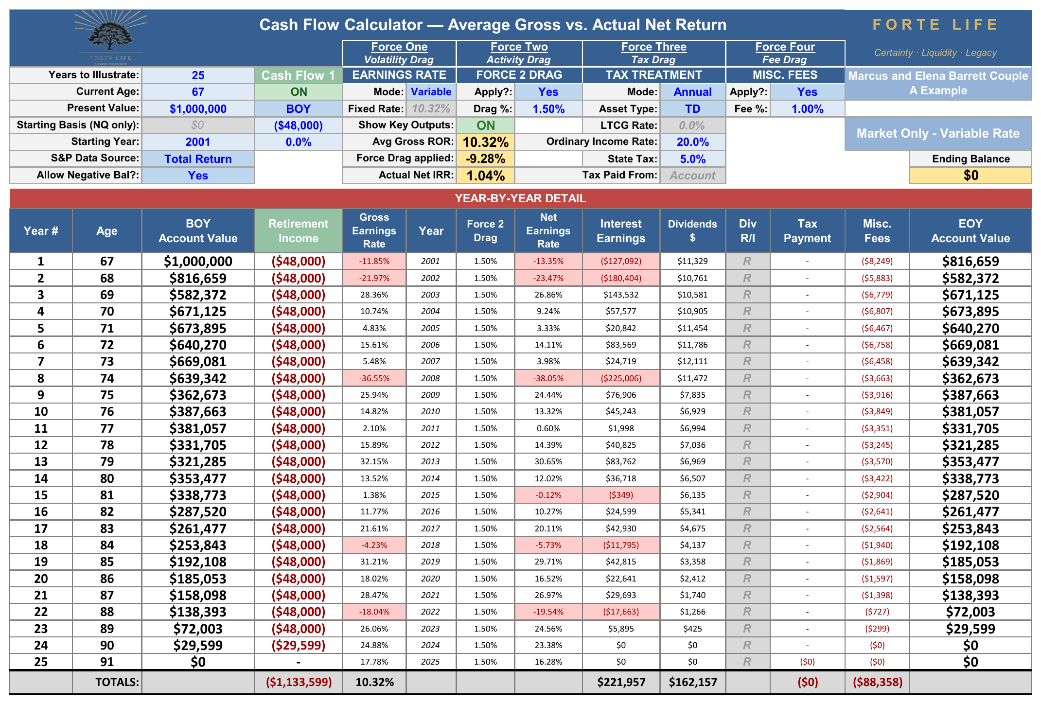
Two details deserve a second look. The average gross return across these twenty-five years was 10.32% — the very number the brochure advertises — and the account still emptied, because the four forces and the order of the returns did their work on every dollar every year. And the account did not fail in a bad market: twenty of the twenty-five years finished positive. It failed at age ninety, in the twenty-fourth year, with only $29,599 left to draw against a $48,000 need — the market simply kept less than the plan assumed, and the sequence of the early losses (2001, 2002, and the −38% of 2008) is what the average can never show. The Actual Net internal rate of return on the whole run was 1.04%.
This appendix reproduces Cash Flow 1 of the Forte Life Cash Flow Calculator (Market Only — Variable Rate): $1,000,000 present value, current age 67, 25 years, S&P 500 total return beginning 2001, 10.32% average gross ROR, 1.50% activity drag, 20% ordinary income tax, 1.00% fee. Every figure is reproducible from the market's own published returns.
This brief is the condensed layer of a three-part body of work. The Living Asset Strategy series examines what a policy’s cash value enables during your lifetime — the dual-use capital mechanics that let the same dollar fund an opportunity while the underlying cash value continues to grow. The Distribution series applies this same rigor to the years after retirement begins, where sequence-of-returns risk reverses much of what is true during accumulation. Together they complete the picture that accumulation alone can only begin.
Data sources: S&P Dow Jones Indices and Robert Shiller historical S&P 500 total-return series, 1926–2025; Morningstar, “Mind the Gap” (2025); S&P Dow Jones Indices, SPIVA U.S. Scorecard, Year-End 2024; Morningstar active vs. passive U.S. fund-asset data (end-2025); and the published dividend interest rate history of a representative major participating mutual insurer, 1989–2026. Full citations appear in the companion whitepaper.